
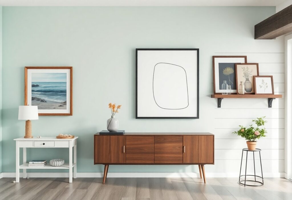
Most of the time, I see people fall in love with a piece of art only to realize it clashes with their home’s vibe, and that’s especially true when mixing styles like coastal, modern, or farmhouse. I’ve been there too-hanging something bold above the sofa, only to feel it overwhelms the room. Choosing the right artwork isn’t just about what you like, it’s about what supports the soul of your space. Let me help you find pieces that feel intentional, personal, and perfectly in tune with your home’s style.
Key Takeaways:
- A coastal style home calls for artwork that mirrors the ease of seaside living, such as watercolor seascapes, framed vintage nautical maps, or abstract pieces in soft blues and sandy neutrals, like those found in a beachside cottage in Cape Cod.
- Modern interiors benefit from bold, minimalist pieces-a black and white architectural photograph or a geometric canvas can anchor a living room with clean-lined furniture and polished finishes.
- Farmhouse decor pairs well with sentimental or rustic art, such as a set of framed botanical prints, an antique mirror repurposed as a gallery piece, or a hand-painted sign with a simple phrase in weathered script.
Key Factors to Consider Before You Start
Before selecting artwork, I consider my room’s style, wall dimensions, and existing color palette. Lighting, furniture layout, and personal connection to the piece also shape my choices. Knowing what matters most helps me avoid impulse buys and focus on pieces that truly belong.
- Assess your space’s style and natural light
- Measure wall dimensions to determine ideal art size
- Align new artwork with your current color palette
- Choose pieces that reflect your personal taste
Measuring your wall space accurately
I always measure the width and height of my wall before shopping. This prevents buying oversized or undersized pieces. I note nearby furniture and outlets, ensuring the art fits comfortably. Knowing the exact space helps me visualize placement and avoid returns.
Thinking about your existing color palette
I look at the dominant and accent colors already in my room’s decor. Art that complements these tones ties the space together. A painting with a hint of seafoam green can echo my coastal cushions. Knowing which hues to highlight keeps my choices intentional.
When I evaluate my living room, I notice how the soft gray sofa and navy throw pillows set a calm tone. I once added a large canvas with deep indigo and sandy beige strokes, and it felt like it had always belonged. Art doesn’t need to match exactly; even a subtle echo of a curtain’s hue can create cohesion. Knowing which colors to pull through makes all the difference.
How-to Choose Art for a Breezy Coastal Home
I start by thinking about how light moves through the space, how the air feels near the windows, and how the colors shift from morning to dusk. Coastal living calls for artwork that breathes with the environment, not fights it. I look for pieces that reflect the quiet rhythm of the tides, the softness of sea mist, or the gentle fade of sun-bleached wood. A painting of a quiet dune trail or a simple line drawing of seabirds in flight can bring that sense of open sky indoors. The right piece feels like a deep breath.
Selecting soothing ocean and nature themes
I often choose art that mirrors the natural world just outside the door, like a quiet seascape or a cluster of seashells drawn in soft ink. A mid-sized SaaS firm might hang abstract waves in a beach house entry, but I prefer subtle nods to nature rather than literal scenes. Overly dramatic storm paintings can disrupt the calm, so I stick to gentle horizons and muted shorelines that echo the peace of a morning walk.
Picking light-colored or driftwood frames
I avoid dark or ornate frames because they weigh down a room meant to feel airy. Instead, I go for whitewashed wood, bleached oak, or weathered driftwood finishes that look like they’ve spent years near salt spray. A frame in soft gray or natural linen-wrapped matting keeps the focus on the art without pulling attention from the view outside the window.
I once hung a large photograph of tidal pools in a simple driftwood frame above a linen sofa, and the way the light caught the frame’s texture made it feel like part of the room’s history. The frame didn’t shout for attention but instead blended with the worn wood floor and sea-blue cushions. I’ve found that even a slightly imperfect frame, with knots or grain variation, adds authenticity. Mass-produced black frames would’ve ruined the effect.
How-to Find the Perfect Modern Masterpiece
I look for pieces that reflect clean lines and intentional simplicity when styling a modern space. A single bold piece above the sofa can anchor the room, especially when it contrasts with neutral walls. The right artwork doesn’t compete with furniture-it complements the architecture. I often choose pieces with unexpected textures or asymmetrical balance to add quiet drama.
Embracing bold abstracts and geometric shapes
Abstract paintings with sharp angles or layered color blocks bring energy without clutter. I once hung a large crimson and charcoal canvas in a white-lit living room, and the way it pulled in the sofa’s accent pillows was pure serendipity. These pieces work best when they echo a subtle hue from your furnishings.
Keeping it sleek with minimalist photography
I love using black-and-white architectural shots or foggy shoreline prints in tight groupings of three. Their quiet tone keeps the room feeling open and intentional. Avoid ornate frames-they break the spell. Simple black or brushed metal borders maintain the clean aesthetic.
One minimalist photograph I hung in a narrow hallway doubled the perceived depth of the space. The image, a long desert road fading into mist, drew the eye forward and made the passage feel like an extension of the living area. Scale matters more than you think, especially in tighter layouts where less truly reads as more.
Tips for Nailing the Cozy Farmhouse Look
To capture the cozy farmhouse aesthetic, I focus on warmth, simplicity, and lived-in charm. Rustic textures, vintage vibes, and botanical prints bring authenticity to the space. I always look for pieces that feel personal and grounded. Assume that Coastal Farmhouse Decor Ideas can inspire a softer twist on this style.
Looking for rustic textures and vintage vibes
I love using weathered wood frames and canvas pieces with subtle distressing to enhance the farmhouse feel. These elements add character without overwhelming the room. Antique mirrors or repurposed signs often become conversation starters. The goal is to create a space that feels collected over time, not decorated overnight.
Incorporating heartwarming botanical prints
I often choose soft-toned prints of lavender, eucalyptus, or wildflowers to bring gentle life to farmhouse walls. These images add a quiet freshness that complements neutral palettes. Botanical illustrations in muted inks or watercolors feel especially authentic. Assume that simplicity in subject and color keeps the look grounded and warm.
When I select botanical art, I lean toward framed vintage gardening plates or hand-labeled herb prints. They connect the home to nature and tradition in a subtle way. A series of small prints in a kitchen nook can evoke memories of Sunday mornings and garden harvests. Soft green and creamy parchment tones blend seamlessly with shiplap or beadboard walls.
Helpful Tips for Arranging Your New Artwork
Start by laying out your pieces on the floor to test compositions before making wall marks. I always group items by color tone, frame style, or theme to create cohesion. Keep spacing consistent-around 2 to 3 inches between frames works best. Perceiving Can coastal and farmhouse decorating styles be mixed in a … helps inspire unexpected but harmonious pairings.
Creating a balanced and friendly gallery wall
I like mixing large centerpieces with smaller accents to avoid a cluttered look. Using odd numbers of frames, like three or five, often feels more natural and inviting. Balance visual weight by pairing bold pieces with lighter ones across the arrangement.
Hanging your pieces at the perfect eye level
The center of the artwork should sit around 57 to 60 inches from the floor. This standard keeps viewing comfort consistent in most rooms. I adjust slightly for furniture height, especially above sofas or consoles.
When hanging art above furniture, I leave 6 to 8 inches between the top of the piece and the item below. This gap creates breathing room without disconnecting the elements. In hallways or dining areas, I sometimes lower the center point slightly to match seated sightlines, especially near benches or chairs. The goal is effortless connection between your eyes and the art, not rigid rules.
Final words
I always keep your space in mind when suggesting artwork, because what feels right in a coastal living room might not suit a farmhouse kitchen, even if both are your favorite styles. I’ve seen how a simple linen-textured abstract can ground a modern dining area, or how a faded maritime map brings quiet joy to a beachside nook. Your walls don’t need busy statements to feel personal. I like to remind you that the best piece is often the one you pause to look at twice, the one that makes you say, “That’s it,” without knowing why.