
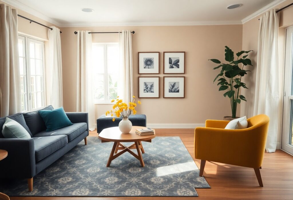
This was my living room just six months ago: a bright coral wall that made the space feel more like a teenager’s bedroom than a cozy retreat. I’ve learned that choosing color doesn’t mean going bold everywhere, and one dominant hue can dominate your peace if you’re not careful. In this post, I’ll walk you through how I found balance-using color to energize a room, not exhaust it-so you can love your walls without feeling boxed in.
Key Takeaways:
- A neutral base with intentional pops of color-like a navy armchair in an otherwise beige living room-creates visual interest without dominating the space.
- The 60-30-10 rule, when applied with a warm gray dominant tone, soft sage secondary shades, and mustard yellow accents, keeps color layered and balanced.
- Testing paint swatches at different times of day reveals how natural light shifts affect color perception, preventing unintended intensity in the final scheme.
Identifying Key Room Factors
Room size, layout, and natural light play a major role in how color behaves in your space. I always consider the existing architecture, furniture, and how you use the room before choosing a palette. Knowing these elements helps you pick hues that enhance, not fight against, your environment.
Evaluating the size and layout of your space
Small rooms can feel closed in with dark walls, so I often suggest lighter tones to open them up. The flow between connected areas matters too-if colors clash from room to room, the whole space feels disjointed. Knowing how you move through the room helps determine where color works best.
Assessing how natural light affects different hues
North-facing rooms get cool, gray light that can make blues and greens feel flat without warmth. In contrast, south-facing spaces flood with sunlight, intensifying reds and yellows. Knowing how light shifts throughout the day helps you avoid unexpected color surprises.
I once helped a client paint a bedroom in what looked like a soft sage at noon, only to find it turned almost blue by evening. Natural light changes hue and saturation dramatically depending on direction and time. That’s why I always test swatches on multiple walls and observe them at different hours.
How to Use the 60-30-10 Rule
I rely on the 60-30-10 rule to keep color schemes feeling balanced and intentional. By assigning 60% of the room to a dominant shade, 30% to a secondary color, and 10% to an accent, I create harmony without monotony. It’s simple but powerful, especially when I’m working with bolder hues that could easily take over.
Picking a dominant neutral for the foundation
My go-to move is choosing a soft neutral-like warm gray or beige-for the 60% base. This gives the room a calm backdrop that lets other colors shine. I’ve found that even in colorful spaces, a neutral foundation keeps things from feeling chaotic or overstimulating.
Distributing secondary and accent colors evenly
I place the 30% secondary color in larger elements like curtains, a sofa, or an accent wall, then sprinkle the 10% accent through smaller items like throw pillows or art. Spreading them across the space prevents one area from feeling too heavy. The balance makes the eye move naturally, not get stuck.
When I’m placing secondary and accent colors, I often step back every few minutes to check how they interact. For example, if I use navy as my secondary, I might add rust cushions, a small rug, and a framed print with matching tones. Repeating each color in at least two spots creates rhythm, and the visual flow keeps the room feeling pulled together, not scattered.
Tips for Choosing a Soothing Base
Start with neutral tones like beige, gray, or soft white to create a calm foundation. I always test swatches at different times of day since lighting shifts how a color reads. Choose hues with undertones that match your room’s natural light. This helps the space feel cohesive and restful.
- Neutral tones keep the room feeling open and calm
- Undertones can make a big difference in mood and warmth
- Greige blends warmth and coolness for balanced depth
- Off-whites add subtle contrast without stark brightness
Selecting the right warm or cool undertones
Warm undertones like peach or cream soften a space with northern light, while cool undertones such as blue or green enhance rooms flooded with afternoon sun. I once painted a small bedroom in a gray with purple undertones and it turned unexpectedly pink at dusk. This taught me to always observe paint in the actual room light.
Using “greige” and off-whites as a visual buffer
Greige-a blend of gray and beige-acts as a quiet backdrop that supports bolder accents without competing. Off-whites like ivory or oatmeal add dimension while staying subtle. This gives the eye a place to rest amid richer textures or patterns.
I’ve found that greige works especially well in open-plan spaces where multiple colors meet. It bridges warm wood floors and cool metal fixtures without leaning too far in either direction. A client’s kitchen-dining area felt disjointed until we switched to a greige wall, instantly harmonizing the zones. This subtle shift made the whole floor plan feel intentional.
How to Introduce Bold Accents Gradually
I’ve found that starting small keeps the energy in a room feeling intentional, not chaotic. Bold choices become exciting rather than overwhelming when they unfold slowly, giving you time to adjust and refine. One color at a time is more than enough to make a statement.
Starting small with pillows, rugs, and throws
I often switch out neutral pillows for ones in a rich terracotta or deep teal, and the shift feels fresh without commitment. A patterned rug or a cozy throw in a vibrant hue can anchor a corner, adding warmth and personality without dominating the space.
Bringing in color through vibrant wall art and plants
I love hanging a single piece of art with bold reds or sunny yellows-it draws the eye without crowding it. A potted fiddle-leaf fig beside it adds life, making the color feel natural and grounded.
One gallery wall I styled used just three framed prints with shared warm tones, spaced evenly above a sofa. The plants nearby-deep green with variegated edges-picked up the yellow in the canvas, creating harmony between nature and art. This kind of layering keeps color dynamic but controlled.
Essential Tips for Maintaining Balance
To keep color from overwhelming a space, I focus on balance through thoughtful distribution. Using the 60-30-10 rule as a guide, I layer dominant, secondary, and accent hues across furniture, textiles, and decor. Mixing textures adds depth without introducing more color. Leaving enough white space gives the eye room to rest. This How to Add Color Without Overwhelming Your Space guide offers practical inspiration. This works best when every color has a purpose.
Mixing textures to add interest without extra pigment
I often use a linen sofa, a wool throw, and a rattan side table in the same neutral tone. These varied textures create visual movement without adding another color. This keeps the palette calm while still feeling layered and inviting.
Leaving enough “white space” for the eyes to rest
I make sure at least 30% of the room feels visually light, whether through actual white walls or open negative space around furniture. This breathing room prevents the design from feeling too busy or intense.
Even in a richly colored room, I always preserve empty wall sections, uncluttered surfaces, and open floor areas. A mid-sized SaaS firm redesigned their lounge with deep teal walls but kept the ceiling, trim, and half the floor space neutral. This contrast made the color feel intentional, not suffocating.
Factors for Testing Your Palette
Before committing to a color scheme, I always test it in the actual space under real conditions. Lighting, furniture, and even wall texture can alter how a shade appears. I recommend checking your paint swatches at different times of day and from multiple angles. You might be surprised how a warm gray can read cool under afternoon light. How to incorporate bold colors without overwhelming the room often comes down to this kind of hands-on evaluation. This attention to detail prevents costly missteps.
Painting large swatches to see transitions
I paint foot-square sections on different walls to see how the color flows from one area to another. This helps me catch any jarring shifts near windows or doorways. A hue that looks soft in the corner might feel intense beside trim. Seeing these transitions up close gives me confidence in my final choice.
Observing color shifts from morning to evening
I keep an eye on how natural and artificial light changes the tone throughout the day. Morning sun can make a pale blue feel crisp, while evening lighting might bring out its green undertone. These color shifts are subtle but impactful. This awareness helps me choose shades that feel consistent and inviting.
One time, I selected a lavender-gray for a client’s bedroom, only to notice by dusk it leaned unexpectedly warm, almost mauve. The change wasn’t obvious at noon but became pronounced under lamplight. I realized the room’s south-facing windows flooded it with golden afternoon rays, altering the pigment’s behavior. This taught me to observe a color across multiple lighting conditions before finalizing. This practice has saved me from mismatched finishes and disappointed clients.
To wrap up
I’ve found that decorating with color works best when I let the space guide me, not the other way around. You don’t need bold walls to make a statement-a single painted bookshelf, a set of vibrant cushions, or a colorful rug can shift the whole mood. I always suggest starting small, living with your choices a few days, then adjusting. For your home, that slow build often leads to a palette that feels personal, lively, and just right.