
Home is where I want to feel calm the moment I walk through the door, and I’ve learned that color plays a powerful role in shaping that feeling. You don’t need a full renovation to shift the mood-just a few thoughtful paint choices can make your space feel instantly more peaceful. I’ll walk you through the shades I’ve seen transform rooms from chaotic to serene, based on real experiences and a little color psychology.
Key Takeaways:
- Soft blues, especially those mimicking natural water bodies, can reduce heart rate and create a sense of calm, making them ideal for bedrooms and reading nooks.
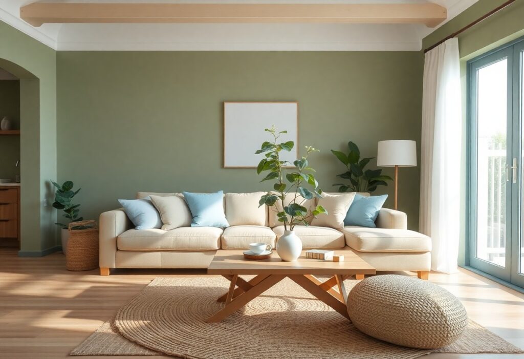
- Earthy greens, like the muted tones of sage or olive, connect indoor spaces to the outdoors and are particularly effective in home offices or kitchens.
- Neutral tones such as warm grays and creamy whites provide a quiet backdrop that enhances the relaxing effect of other colors without overwhelming the senses.
The Blue of the Gulf Stream
I’ve always found that shades pulled from the Gulf Stream bring a quiet depth to a room, the kind that slows your breath without you noticing. There’s something about blue that feels like it holds space for calm, especially when it mirrors natural water movements.
Pale morning light
I often suggest starting with the softest edge of this palette-think of the sky just after sunrise over warm coastal water. This gentle blue-gray, almost silvery, reflects light beautifully and makes small rooms feel airy and settled. It’s the kind of color that never overwhelms, perfect for a bedroom where peace matters most.
Deep salt water
This is the rich, saturated tone found in open ocean swells, a blue with just a whisper of green. I use it sparingly-on an accent wall or in textiles-because its intensity can dominate if overused, but when balanced, it adds a grounding, meditative quality.
When I worked with a client on a coastal Florida home, we painted the reading nook in a deep salt water hue, pairing it with bleached oak and linen. The space, tucked under a slanted roof, became their favorite spot for morning tea. The color seemed to absorb outside noise, creating a pocket of stillness even during afternoon storms. It wasn’t just the shade itself, but how it changed with daylight-darker and more solemn at dusk, almost navy, then softening by midday.
The Green of the High Country
I find that greens inspired by mountainous regions bring a quiet strength to a room. They don’t shout, but instead settle into the space like a familiar trail underfoot. These tones pull from alpine air and sunlit slopes, offering a grounded calm that feels both fresh and deeply comforting.
Sagebrush and pine
Earthy sagebrush green mixed with the deeper tone of pine needles creates a layered, natural palette. I’ve seen this combination work beautifully in a cabin kitchen, where the lighter green wraps the walls and the cabinetry takes on a soft evergreen hue. The effect feels alive but never overwhelming.
Shadows in the woods
Deep, cool greens that mimic the shade beneath a forest canopy add instant depth. I once painted a small reading nook in a gray-green that vanished in low light, making the space feel like a hidden grove. These tones are surprisingly soothing, especially where natural light fades early.
That shadowy green isn’t just for cabins or rustic homes. In a mid-sized SaaS firm’s break room, the same hue lined the lower half of the walls, grounding the bright white above. Employees mentioned feeling more centered during short breaks, drawn to the corner with the armchair and floor lamp. The color didn’t dominate, but it held the space together, like tree trunks in a quiet wood.
The Dust of the Road
I find warmth in earthy neutrals, colors that echo sunbaked paths and weathered adobe walls. These tones ground a space, making it feel sheltered and steady. For more inspiration, I often revisit 12 Wall Colors That Instantly Make Any Room Feel More …, where soft terracotta and clay-inspired hues stand out for their quiet strength.
Warm sand and stone
My go-to when I want a room to feel both open and cozy is a blend of warm sand and stone tones. These colors reflect natural light beautifully, especially in spaces with lots of windows. I’ve seen them transform a mid-sized SaaS firm’s office into a serene environment where focus and calm coexist.
Sun-bleached linen
This shade reminds me of fabric left too long in the sun-faded, soft, and effortlessly peaceful. I use it on walls and linens to create a lived-in serenity. It pairs perfectly with raw wood and woven textures, bringing a quiet elegance that never feels staged.
When I first tried sun-bleached linen in my bedroom, I was surprised by how quickly the space felt more restful. It’s not just a color, it’s a mood-a whisper of summer afternoons and slow mornings. Unlike stark whites, it has warmth without heaviness, making ceilings feel higher and walls recede. I always recommend testing it under different lights, since its depth shifts from dawn to dusk.
The Purple of the Mountains
I find something quietly magical about purple in a room, not the bold violet of a theater curtain, but the soft, dusty tones that echo mountain shadows at dusk. This isn’t a color that shouts; it settles, like cool air after sunset.
Soft lavender fields
Lavender fields inspire a gentler side of purple, one I’ve seen work beautifully in a friend’s bedroom with pale lilac walls and white linens. The effect feels calming, like a slow breath after a long day.
Evening mist
Evening mist captures purple’s most subtle form, a barely-there hue that blends with gray and blue on distant ridges. I use this tone in a hallway with matte paint, and it makes the space feel hushed, almost secretive.
That misty purple works because it doesn’t dominate. Instead, it absorbs light, creating a buffer between rooms and noise. A client once told me they started pausing in that hallway, just to collect themselves before moving on, which surprised us both.
The White of the Clean Room
I find that clean white walls can make a room feel instantly calmer, almost like a reset button for the mind. Choosing the right white matters-some lean cool, others warm-and 17 Calming Colours for Your Home offers excellent guidance. The subtle undertone is what keeps it from feeling sterile.
Chalk and bone
Chalky whites with a hint of gray, or bone tones that carry a whisper of beige, add softness without glare. I’ve used these in small bathrooms and hallways where light bounces but warmth still matters. The gentle neutrality makes them pair beautifully with natural wood and linen textiles.
Morning mist
This shade sits just between white and gray, like fog lifting off a lake at dawn. I once painted a north-facing bedroom in a morning mist hue and noticed how it stayed calm all day. The cool serenity works best when balanced with warm flooring or a textured throw.
What makes morning mist special is how it shifts with daylight, appearing almost silver in the afternoon and softening to a hazy pearl by evening. I recommend testing it on a large swatch first, as it can read differently depending on your windows’ direction. The quiet depth it adds feels intentional, never flat.
Conclusion
I’ve found that soft blues and gentle greens often do the most to calm a space, like the way morning light touches a quiet lake or mist hangs between pine-covered hills. You don’t need a full repaint-sometimes just a single wall or a few well-chosen textiles shift the whole mood. When you choose colors that mirror the natural world, your home starts to feel less like a structure and more like a breath.