
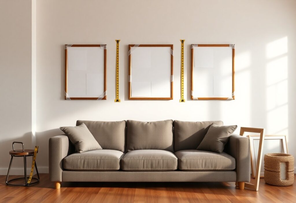
There’s a quiet magic in hanging a painting that fits just right, like it was always meant to be there. I’ve learned that an oversized piece can overwhelm a room, while a tiny one gets lost on a big wall. You don’t need a design degree to get it right, just a few clear guidelines. Let me walk you through how to pick the perfect size for every space in your home, from cozy nooks to wide open walls.
Key Takeaways:
- A painting should occupy about two-thirds to three-quarters of the wall space above a piece of furniture, such as a sofa or bed, to create visual balance without overwhelming the area.
- For large, empty walls, a single oversized piece often makes a stronger impact than several smaller works, especially in rooms with high ceilings or open layouts.
- When working with narrow or small walls, opt for vertical or square-format paintings that fit the proportions of the space, like a 24×36 inch canvas on a slender hallway wall.
Essential Factors for Choosing the Right Size
Wall size, furniture placement, and viewing distance shape how a painting feels in your space. I always consider the proportions of the wall and nearby pieces, the height at which I’ll see the art, and whether the room encourages close or distant viewing. Thou should also reflect on how natural light and frame weight affect presence.
Thinking about your wall’s shape and orientation
A tall, narrow wall calls for vertical art, while wide spans suit horizontal pieces. I once hung a long landscape on a broad staircase wall, and it guided the eye upward beautifully. The orientation of your wall should lead your choice, not fight it.
Considering the distance from your furniture
I usually leave 6 to 8 inches between a painting and the furniture below, like a sofa or dresser. This gap creates breathing room and visual connection. Keeping this distance consistent helps the piece feel anchored, not floating.
When I style above a low bookshelf or bed, I pay attention to how far back the furniture sits from the wall and how high the ceiling feels. A piece too high above a nightstand can feel disconnected, especially in a cozy room. I adjust the hanging height based on sightlines, making sure the center of the painting rests around eye level when seated. This small detail makes a big difference in comfort and balance.
How-to Measure Your Wall Like an Expert
I always grab a soft measuring tape and start from the floor, running it up to the ceiling to note the full height. Then I measure the wall’s width, taking care near corners or molding. Knowing these numbers helps you avoid guessing and ensures your chosen artwork fits just right, especially when shopping online where sizes can be misleading.
Using the painter’s tape trick for visualization
I like to outline the painting’s dimensions with painter’s tape directly on the wall. This simple trick shows exactly how much space the piece will occupy. You can step back and live with the shape for a day or two. It’s surprising how often a size that looks perfect online ends up overwhelming a wall in real life.
Finding the sweet spot for eye-level viewing
I aim to hang the center of the artwork about 57 to 60 inches from the floor, which aligns with average eye level. This range works well in most homes and keeps the piece comfortable to view without straining. It’s a small detail that makes a big difference in how naturally the art fits into your space.
When I’m fine-tuning the height, I consider the furniture below. If a painting hangs above a sofa, I leave 6 to 8 inches between the top of the furniture and the bottom of the frame. This gap creates breathing room while keeping the pieces visually connected. In rooms where people stand more often, like hallways, I adjust slightly higher based on the average line of sight. Even a two-inch shift can change how balanced the artwork feels in the room.
Handy Tips for Art Above Your Couch or Bed
- Leave about 6 to 8 inches between the furniture and the bottom of the frame for a cohesive look
- Aim for the artwork width to be at least 70% of the couch or bed span
- Center the piece directly above the furniture for natural visual alignment
- Consider groupings or diptychs if a single piece feels too large or too small
Getting the width just right for a balanced look
I always measure my sofa first, then look for art that covers roughly two-thirds of its length. A narrow painting on a wide couch breaks the flow, while something too wide overwhelms. I once hung a 24-inch piece above a 90-inch sectional, and it looked lost. After adjusting to a larger canvas, the wall felt complete.
Avoiding the common “too small” mistake
I used to think a tiny painting would look delicate above my bed, but it ended up looking like an afterthought. A small frame on a large wall creates visual imbalance. After switching to a bigger piece, the room felt more grounded and intentional.
I’ve seen so many living rooms where a petite painting dangles on a vast wall, surrounded by empty space. It draws attention to what’s missing rather than the art itself. That lonely look makes the whole arrangement feel uncertain. After replacing it with a larger piece or a small cluster, the difference is always clear and immediate.
Choosing Statement Pieces for Large Walls
I always look for artwork that commands attention when I face a wide, open wall. A single large piece can transform a blank space into a focal point, especially in living rooms or entryways. The key is scale-your eyes should feel the impact from across the room, not strain to connect with something too small. I’ve seen a simple black and white photograph stretch across an entire wall in a loft and become the soul of the space.
Going big with impressive oversized art
Oversized art works best when it covers at least two-thirds of the wall’s width. I once hung a 6-foot canvas in a client’s dining room, and the difference was immediate-the room felt grounded and intentional. Large-scale paintings don’t just fill space, they define the mood. Just make sure there’s enough breathing room around it, so the piece isn’t competing with furniture or trim.
Filling up those tall, empty vertical spaces
Tall walls, like those in stairwells or two-story foyers, need height as much as width. I often recommend vertical-format paintings or a stacked arrangement of two to three pieces aligned centrally. A single tall artwork, like a narrow landscape or abstract triptych, draws the eye upward and emphasizes architectural lines without overwhelming the space.
One solution I rely on for vertical areas is a custom triptych with consistent color tones across panels. I used this in a narrow hallway where a single piece would’ve looked awkward. The segmented design added rhythm and movement, making the space feel curated rather than empty. Matching the frame style keeps the look cohesive, even if the images vary slightly in subject.
Friendly Tips for Styling Small or Narrow Walls
When working with limited wall space, I focus on proportion and placement to keep things balanced. A few well-chosen pieces can make a narrow wall feel intentional, not awkward. I always recommend considering the orientation of the art and grouping smaller works to create a cohesive look. The How to Choose Art That Is The Right Size For Your Space guide offers helpful visuals for getting it just right.
Picking the perfect orientation for tight spots
Vertical pieces often work best on narrow walls, drawing the eye upward and enhancing the sense of height. I’ve found that a tall, slender painting or print can turn an overlooked hallway nook into a quiet moment of style. The orientation should follow the wall’s natural lines, not fight them.
Making a big impact with tiny treasures
A single small frame can get lost, but a curated cluster of mini artworks adds personality without overwhelming the space. I love mixing tiny sketches or postcards in matching frames for a collected-over-time feel. The effect is unexpected and full of charm.
One of my favorite tricks is using a set of three small, similarly framed botanical prints in a tight bathroom. They bring warmth and a sense of detail without crowding the wall. The key is keeping the frames consistent and the spacing tight-about two inches apart works perfectly. The arrangement feels deliberate and brightens the whole room.
Simple Tips for Creating a Gallery Wall
Creating a cohesive gallery wall starts with choosing a unifying element, like frame color or theme, so the collection feels intentional. I mix art styles but keep visual balance by varying sizes and shapes. Use paper templates to map positions before hanging. Knowing your space and style helps avoid overcrowding. For more inspiration, check out this Wall Art Size Guide For Your Home.
Mixing different sizes without the clutter
Large pieces anchor the arrangement, while smaller ones fill gaps naturally. I place the biggest artwork slightly off-center to create flow and draw the eye. Grouping odd numbers of frames adds rhythm without feeling too rigid. Knowing how to space them keeps the look open and balanced.
Planning your layout for a professional finish
I lay out my gallery on the floor first, adjusting until the composition feels right. This step helps me see spacing and alignment clearly. Using painter’s tape to label each piece’s position on the wall makes hanging easier. Knowing where each frame belongs reduces mistakes and saves time.
When I plan a layout, I often start with the center piece and build outward, ensuring symmetry or balanced asymmetry depending on the vibe I want. Keeping consistent spacing-about 2 to 3 inches between frames-creates a clean, curated look even with eclectic art. Some people use digital tools to visualize arrangements, but I prefer the hands-on method with paper cutouts. It’s low-tech but effective, especially when working with irregularly shaped pieces or corners.
Conclusion
I always keep one thing in mind when picking art for a wall: it should feel like it belongs. You don’t need a calculator or design degree, just a tape measure and a moment to step back and look. I’ve hung small sketches in tight hallways that make guests smile, and oversized pieces in living rooms that become instant focal points. When you choose a painting that fits both the wall and your life, it stops being decoration and starts feeling like home.