
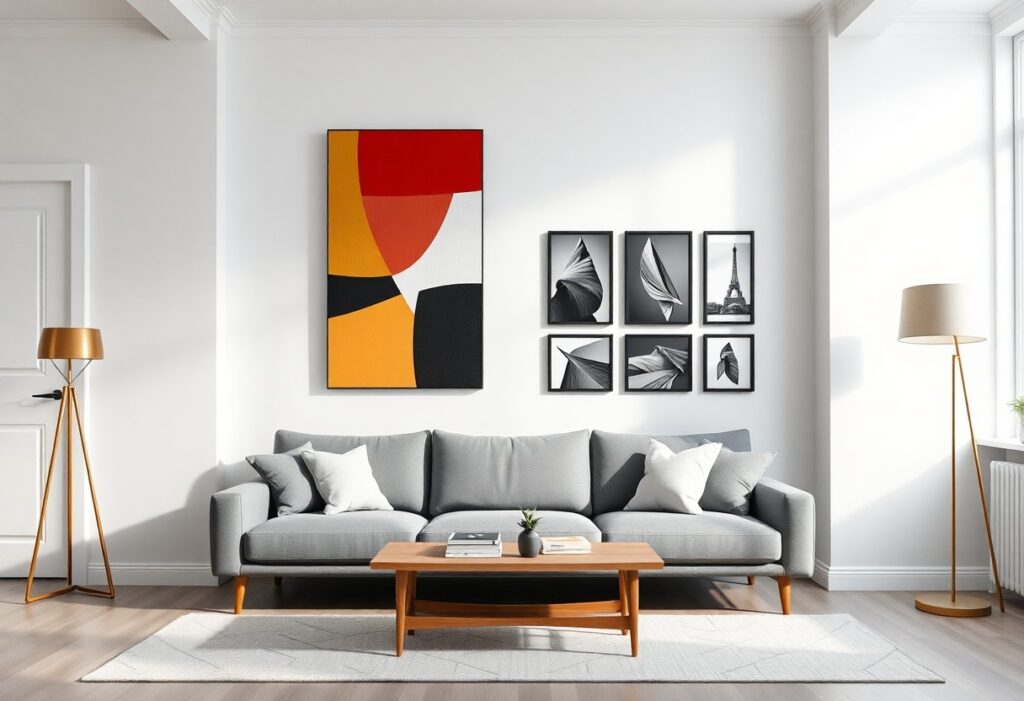
Many of us love white walls for their clean, airy feel, but I’ve learned they can make choosing artwork surprisingly tricky. You want pieces that feel intentional, not lost. The right art can transform your space, while the wrong choice might leave your room feeling cold or incomplete. I’ll help you pick pieces that bring warmth, personality, and just the right pop of color to your white-walled home.
Key Takeaways:
- A large abstract painting in warm earth tones can ground a minimalist living room, proving that one bold piece often makes a stronger statement than several small prints.
- A mid-sized SaaS firm’s office redesign showed how curated artwork along white hallways improved employee engagement during informal meetings, highlighting art’s subtle role in shaping atmosphere.
- Framed black-and-white photography with thin black borders creates visual rhythm against white walls without overwhelming the space, especially when grouped in an asymmetrical layout.
Considering Key Room Factors
Room size, ceiling height, and existing furniture all influence how artwork interacts with white walls. I pay attention to foot traffic patterns and where people naturally pause, since those spots make ideal viewing zones. Perceiving the full context helps me choose pieces that feel intentionally placed, not just filled in.
Assessing the natural light in your space
Light changes throughout the day, affecting how colors and textures in your art appear. I notice how morning sun hits my east-facing living room, making bold hues pop, while north-facing rooms stay cool and even. Glossy finishes can create glare, so I often opt for matte when light streams in all day.
Measuring your available wall dimensions
I always measure the empty wall space before browsing frames, noting height and width down to the inch. This prevents buying oversized pieces that overwhelm the wall or tiny ones that look lost. Perceiving negative space as part of the composition keeps the balance intentional.
When I measure, I also account for nearby furniture like sofas or consoles, leaving at least 6-8 inches between the art and the top of the piece. I sketch a quick outline on the wall with painter’s tape to visualize scale, especially for groupings. A large blank wall above a low credenza, for example, might need a single vertical piece or a stacked diptych rather than a wide frame.
How to Choose the Perfect Color Palette
I look for colors that either pull from existing tones in the room or intentionally contrast them. A splash of cobalt in a painting can make gray accents pop, while a warm terracotta piece brings life to cool white walls. The right palette creates balance, whether through harmony or tension.
Creating a bold contrast with bright hues
When I hang a vibrant yellow abstract piece in my hallway, the energy shifts instantly. Bright hues like fuchsia, emerald, or tangerine stand out dramatically against white walls, turning a quiet space into a focal point. These colors work best when you want the art to lead the conversation.
Keeping it serene with soft neutrals
I often choose artwork with warm beiges, soft grays, or muted taupes to maintain a calm atmosphere. These tones blend gently with white walls, creating a subtle, cohesive flow between the art and the room. It’s ideal for bedrooms or reading nooks where quiet elegance matters most.
One piece I love is a linen-textured print with faint charcoal lines and a whisper of oatmeal color. It doesn’t shout, but it holds attention through texture and restraint. Soft neutrals invite longer looking, rewarding you with quiet details over time. They also pair beautifully with natural wood frames and woven textiles, deepening the sense of warmth without overwhelming the space.
Tips for Finding Your Unique Style
Exploring what resonates with you helps uncover your personal aesthetic. I pay attention to colors, subjects, and textures that draw me in over time. Whether it’s vintage photography or bold modern abstracts, your walls should reflect your journey. Assume that every piece you choose adds meaning. For more inspiration on aligning art with your space, check out this guide on Choosing Artwork for Your Home – Magnolia.
- Focus on emotional connection over trends
- Collect pieces from your travels or milestones
- Notice recurring themes in your favorite books or films
- Visit local galleries to discover emerging artists
Selecting pieces that tell your personal story
I look for artwork that reminds me of a place I’ve loved or a moment that shaped me. A small watercolor from a weekend in Maine or a black-and-white photo from my grandmother’s attic holds more meaning than any expensive print. Assume that authenticity always stands out.
Mixing modern abstracts with classic sketches
I enjoy pairing a jagged, colorful abstract above the sofa with a delicate ink drawing nearby. The contrast creates visual interest without clashing. Assume that balance comes from shared tones or framing style.
One way I make this combination work is by using matching white frames to unify disparate pieces. A large modern abstract in rust and navy anchors the wall, while a cluster of smaller classic sketches in similar hues adds depth. The mix feels intentional, not random, because the colors echo across each piece. Even when the styles differ, a consistent color thread ties everything together.
How to Size Your Art Just Right
Getting the size right changes how a room feels, and I always start by measuring the wall space available. A piece that’s too small can look lost, while one that’s too large might overwhelm. I aim for artwork that fills the visual gap without crowding it, usually covering about two-thirds of the furniture width when hung above a sofa or console.
Following the golden rule of proportions
I often use the two-thirds rule when placing art above furniture, aligning the width of the piece with the width of the surface below. This keeps the arrangement visually balanced and prevents the artwork from looking like an afterthought. Sticking to this proportion creates harmony and draws the eye naturally from the furniture to the wall.
Making a statement with oversized canvases
Sometimes I go bold with a single oversized canvas, especially on a long, empty wall. A large piece instantly becomes a focal point, giving the room energy and personality. It’s surprising how one big artwork can replace an entire gallery wall and still feel complete.
When I choose an oversized canvas, I make sure it has enough visual weight-through color, texture, or subject-to justify its size. A massive blank or minimalist piece might fall flat, but a richly layered abstract or a high-contrast photograph holds its own. I once hung a floor-to-ceiling canvas in a narrow hallway, and the depth it added made the space feel more intentional, almost like a curated passage. The scale transformed a forgotten corner into a moment worth pausing for.
Framing Tips to Enhance White Walls
Choosing the right frame can quietly transform how your artwork interacts with white walls. I often recommend considering frame color, material, and proportion to the piece and wall space. A well-chosen frame adds depth without competing. For more guidance, check out this helpful resource: How to Choose Art for Your Home: A Step-by-Step Guide …. The right choice brings everything into harmony.
- Match frame width to artwork size-thicker frames suit large pieces
- White walls amplify contrast, so frame color matters more than in busier spaces
- Try floating frames for canvas works to create subtle dimension
- Consistent framing in a gallery wall creates cohesion, even with varied art
- Don’t overlook frame finish-matte wood feels cozier than glossy metal
Using natural wood for a warm touch
I love adding natural wood frames to white-walled rooms because they bring in organic warmth without overwhelming the space. The grain patterns catch the light softly, and the earthy tones balance the sterility of bright white. The effect feels grounded and inviting.
Opting for black frames for a high-drama look
A black frame instantly sharpens the focus on your artwork, creating a bold contrast against white walls. I’ve seen this choice turn quiet corners into striking focal points, especially with minimalist or monochrome pieces. The look is clean, modern, and intentionally bold.
Black frames work especially well when you want your art to feel curated, almost gallery-like. I once styled a narrow hallway with three vertical pieces in slim black frames, and the transformation was dramatic-sleek, intentional, and full of quiet confidence. The strong lines guided the eye forward, making the space feel longer and more purposeful.
How to Arrange a Stunning Gallery Wall
I start every gallery wall by laying the pieces on the floor, where I can step back and adjust without committing to a single nail. This method helps me see how the shapes and colors interact, making it easier to spot gaps or imbalances. Getting the composition right beforehand saves time and drywall repairs later.
Mapping out your layout on the floor first
I always arrange the frames on the floor before touching a hammer. This way, I can shift pieces around freely and see how they connect. Using painter’s tape to mark wall positions helps maintain the design when transferring from floor to wall. It’s the simplest way to avoid costly placement mistakes.
Balancing different sizes for visual interest
I mix large anchor pieces with smaller works to create rhythm and depth. A single oversized print might dominate, but paired with two or three modest pieces, it feels intentional. The contrast in scale draws the eye across the arrangement, making the whole wall more dynamic and engaging.
When I balance sizes, I often place a large piece slightly off-center and build around it with medium and small frames. I once hung a narrow vertical photo next to a wide square canvas, and the tension between them made the pairing memorable. Varying dimensions keep the eye moving and prevent the layout from feeling static or predictable.
Final words
I’ve learned that filling white walls doesn’t have to feel overwhelming. When you choose art that resonates with your story, fits the room’s rhythm, and aligns with your comfort, the space begins to feel like home. A small print above a hallway console or a bold piece behind the sofa can quietly shift the whole mood. I once hung a simple linen-textured piece in my kitchen, and suddenly the room felt warmer, more lived-in. Your walls are listening-speak to them with pieces that make you pause, smile, or remember.