
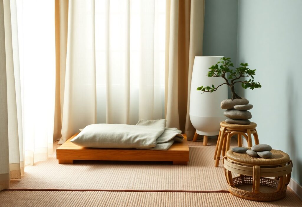
With years of research and practice in environmental psychology, I’ve found that certain colors profoundly influence your mental calm. I guide you through the most effective hues that support relaxation, reduce anxiety, and enhance focus in quiet spaces. Blue and soft green, in particular, have shown measurable effects on lowering heart rate and blood pressure.
Key Takeaways:
- Soft shades of blue are widely recognized for their calming effect, helping to slow heart rate and reduce anxiety during meditation and relaxation.
- Earthy tones like muted greens and warm beiges connect the mind to nature, promoting a sense of balance and grounding in quiet spaces.
- Subtle lavender hues encourage mental clarity and emotional peace, making them ideal for environments designed to support mindfulness and rest.
The Azure of Infinite Heavens
I’ve found that this soft, boundless blue mirrors the sky at dawn-calm, open, and deeply reassuring. You don’t need to be outdoors to feel its effect; even a single wall in this shade can shift your mood. I use it in my meditation nook because it quietly expands the sense of space without overwhelming the mind. Your breath slows, your thoughts soften, and for a moment, you’re held under an endless, peaceful sky. This hue doesn’t demand attention-it simply invites stillness.
The Verdant Silence of the Woods
I find that deep forest green carries a quiet strength few colors match. You don’t just see it-you feel it settle over your mind like a breath held and slowly released. This hue mimics the natural canopy that shelters ferns and moss, grounding your thoughts just as roots anchor a tree. When you close your eyes, this green lingers-not loud, but insistent in its calm. It invites stillness without demand, making it one of the most effective choices for spaces meant to heal.
The Earthy Simplicity of Sand
I find that sand tones ground a space with quiet strength, offering a neutral backdrop that invites stillness. You don’t need bold hues to create calm-sometimes the soft whisper of beige speaks loudest. Discover Serenity: Creating a Wellness Paint Color Palette shows how subtle earth tones support mental clarity. This understated warmth makes your room feel like a quiet breath.
The Twilight Hues of Lavender
I’ve found that lavender carries a quiet magic, especially as daylight fades. You may notice how its soft purple-gray tones mimic the sky just after sunset, creating a sense of gentle closure. I often recommend this shade for meditation corners because it naturally lowers mental chatter and supports emotional balance. Your space feels calmer, as if the air itself has slowed down.
The Muted Grays of Stone
I find that the soft grays of weathered stone ground a space with quiet strength. You don’t need bold tones to feel centered-these understated hues absorb distraction and reflect calm. I’ve watched how they shift subtly in natural light, offering depth without drama. They’re ideal for spaces meant to restore, helping you settle into stillness without effort.
Conclusion
Summing up, I find that soft blues, gentle greens, and warm neutrals most support your meditation and quiet spaces. I’ve seen how these tones calm the mind and deepen focus. When you choose them, you create an environment that naturally invites stillness and inner clarity, enhancing your practice with quiet, steady harmony.