
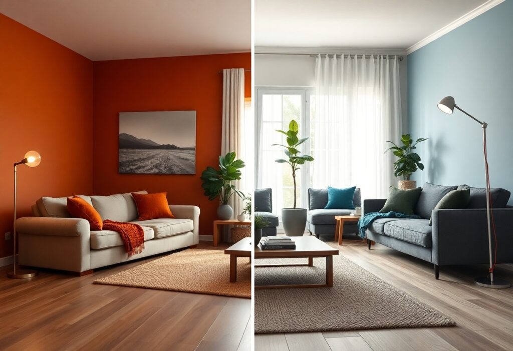
There’s a powerful difference between warm and cool colors, and I’ve seen how they transform your space emotionally. Warm tones like reds and yellows create intimacy and energy, while cool hues like blues and greens bring calm or distance. I’ll show you how your color choices directly shape the mood of your room.
Key Takeaways:
- Warm colors like red, orange, and yellow create a cozy, inviting atmosphere, making spaces feel smaller and more intimate, which works well in living rooms or dining areas.
- Cool colors such as blue, green, and purple promote calm and relaxation, helping rooms feel more spacious and airy, ideal for bedrooms or bathrooms.
- The choice between warm and cool tones can influence mood and perception of space, so selecting the right palette depends on how you want to experience the room.
The Sunlit Palette
I find that warm colors like golden yellows, terracotta, and soft oranges mimic the glow of sunlight, creating a cozy, inviting atmosphere in any space. You’ll notice how these tones make a room feel smaller and more intimate, perfect for living rooms or bedrooms where comfort matters most. When I use a sunlit palette, your walls seem to embrace the light, even on cloudy days, giving your room a consistently uplifting energy.
The Arctic Whisper
I’ve stood in rooms painted in cool Arctic tones and felt the air shift. You don’t just see these hues-you feel them. They lower your pulse, create stillness, and make space breathe. In small doses, they’re refreshing; in excess, they risk emotional distance. I use them to calm overstimulated environments, but always balance with warmth nearby. Your comfort depends on that balance.
Psychological Alchemy
I’ve watched clients transform flat, lifeless spaces into emotionally charged sanctuaries just by shifting from cool to warm palettes. You don’t need to repaint everything-sometimes a single accent wall or set of textiles tips the balance. I learned this through trial and real-world results, not theory. For deeper insight into how these shifts impact your daily mood, explore How the Colors of a Room Affect Moods. Color isn’t decoration-it’s psychology in action.
Spatial Illusions
I’ve noticed how cool colors like soft blues and grays can make a small room feel larger and more open, almost like the walls are receding. You might not realize it, but these tones create a subtle depth that tricks the eye. Warm shades, on the other hand, tend to pull walls forward, making spacious areas feel cozier-or cramped, if overused. Your choice here directly shapes how your space is perceived.
The Art of Balance
I’ve learned that harmony in a room often comes from mixing warm and cool tones thoughtfully. You don’t have to choose one over the other-the most inviting spaces use both. When I pair a warm terracotta accent wall with cool blue textiles, the result feels grounded yet refreshing. Too much warmth can feel overwhelming, while excessive cool tones may distance people. Your space should feel intentional, not one-note. A balanced palette invites comfort and energy in equal measure.
Summing up
Conclusively, I see how warm and cool colors directly shape a room’s mood. I know warm tones like reds and yellows bring energy and coziness, while cool hues like blues and greens create calm and spaciousness. You can use this knowledge to match colors to your desired atmosphere. I guide you to choose based on how you want your space to feel.