
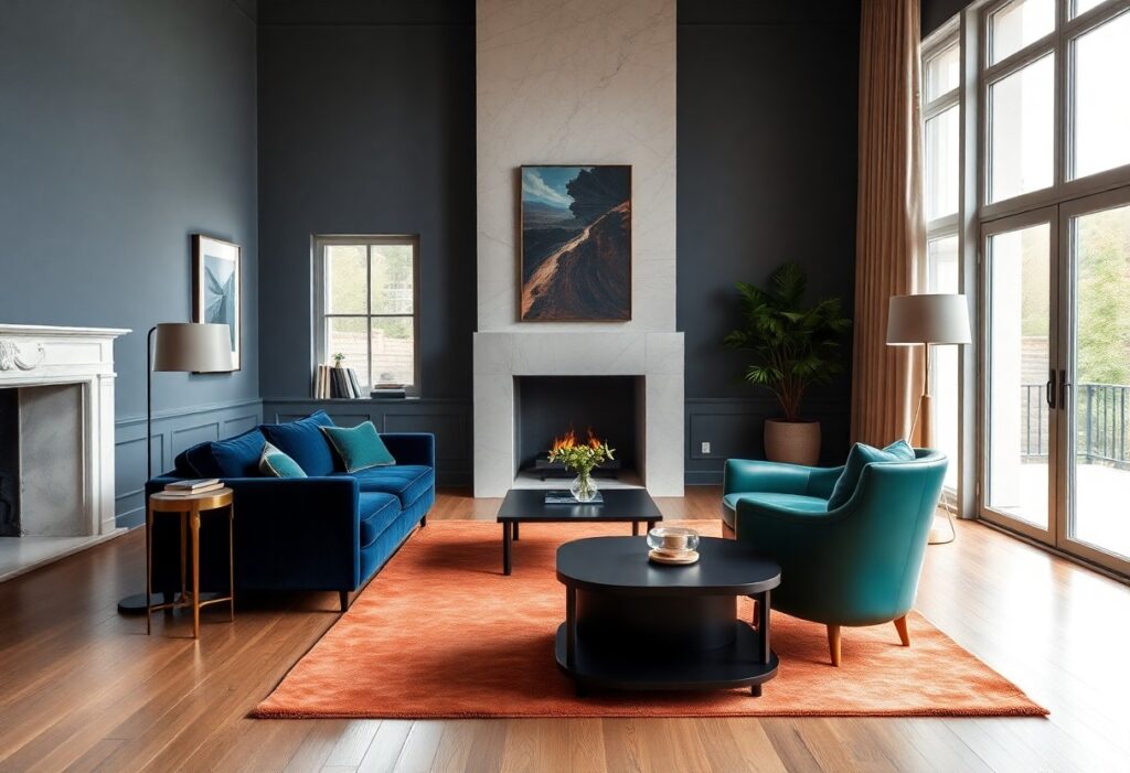
Colors shape how you feel in a space more than you realize. I’ve seen deep blues bring calm, bold reds ignite passion, and neutral tones create serene luxury. In high-end design, the wrong shade can disrupt balance, while the right choice enhances mood and perception. Your environment should reflect intention-every hue carries emotional weight.
Key Takeaways:
- Color choices in high-end interior design directly influence mood and perception, with warm tones like terracotta and gold often creating intimacy and luxury, while cool hues like deep navy or soft gray promote calm and sophistication.
- Designers use color psychology to shape the emotional experience of a space-rich jewel tones can evoke opulence and confidence, whereas neutral palettes with subtle accents allow for personal expression and timeless elegance.
- The interplay of natural light, material finishes, and color affects how a shade is perceived; a carefully selected color can enhance spatial depth, highlight architectural details, and create a cohesive emotional tone throughout a home.
The Divine Boredom of Muted Neutrals
I find that muted neutrals often get dismissed as dull, but their quiet power shapes space in profound ways. These tones don’t shout-they linger, creating environments where emotional clarity can emerge. To understand their subtle influence, explore The Psychology of Colors in Interior Design and see how restraint can be revolutionary.
Ivory and the Transcendent Space
Ivory wraps a room in soft reverence, suggesting purity without sterility. You feel it immediately-a hush, a breath held. This shade opens up interiors, making them feel larger and more serene, inviting light to linger like a quiet prayer.
The Somber Elegance of Slate
Slate brings weight and dignity to a space, grounding it with quiet authority. I notice how it tempers brightness, offering balance where lighter tones might falter. Its presence feels reassuringly stable, like a well-anchored mind.
Slate isn’t just a color-it’s a statement of composed strength. I’ve watched it transform high-end living rooms and master suites, adding depth without drama. Unlike bolder grays, slate carries a cooler, more introspective tone that pairs beautifully with natural wood and matte metals. When used intentionally, it creates a backdrop where emotional stillness becomes part of the design itself.
The Provocation of Scarlet and Crimson
I feel the instant charge when scarlet slices through a room-its energy is dangerous, undeniable. Crimson doesn’t whisper; it commands attention, stirring passion and urgency. You can’t ignore it. This is color as emotion made visible. Learn more in The Power of Color in Design: Psychology & Inspiring Ideas.
Blood-Orange and the Pulse of the Salon
Color pulses like a heartbeat in the salon, where blood-orange ignites conversation and warms modern minimalism. I see how this shade invites movement, making static spaces feel alive. You experience it viscerally-stimulating, bold, immediate-a hue that refuses to be background.
Deep Ruby as a Narrative of Desire
Texture and tone converge in deep ruby, a shade I associate with intimacy and longing. You feel it before you name it-luxurious, enveloping, deeply personal. It’s not just a color; it’s a mood, a silent promise of depth and emotional richness within the space.
When I use deep ruby in a design, I’m telling a story of desire-not just romantic, but for beauty, for warmth, for connection. This is a color that absorbs light and emotion, creating rooms that feel private, almost sacred. Your gaze lingers because something in you recognizes its depth. It doesn’t shout; it draws you in, slow, deliberate, unforgettable.
The Verdant Sanctuary of the Elite
I see how the elite craft personal retreats using green as more than a color-it’s a statement of balance, growth, and quiet power. You’re not just choosing a shade; you’re inviting nature’s rhythm into spaces meant to restore and inspire. This deliberate use of green transforms rooms into sanctuaries, where status meets serenity.
Emerald Tones and the Soul of the Garden
Emerald wraps a room in depth and quiet luxury, like sunlight filtering through ancient leaves. I’ve watched clients pause, breathe deeper, when surrounded by its cool radiance. It awakens a primal connection to life and renewal, turning walls into living landscapes that speak to the soul.
Moss and the Quietude of the Library
Moss green absorbs sound and softens light, making it ideal for spaces meant for thought. I find it draws you inward, encouraging focus without isolation. Its understated richness creates intimacy without heaviness, a hallmark of elite, introspective design.
When I design a library, moss green becomes more than a color choice-it’s a psychological tool. You experience fewer distractions, your eyes relax, and your mind settles. The hue mimics the forest floor, a place of slow growth and hidden life. This subtle mimicry of nature fosters concentration and emotional calm, making the library not just a room, but a retreat for sustained reflection and quiet authority.
The Illumination of Pigmented Surfaces
I see how light transforms color from static to living. A deep emerald wall isn’t just green-it shifts with the sun’s arc, revealing undertones you didn’t expect. I’ve watched clients pause, struck by how a hue they chose at noon feels entirely different at dusk. Light doesn’t just reveal color-it redefines emotion, turning calm into drama, warmth into mystery.
Lustre and the Vanity of the Mirror
Lustre pulls you in with quiet seduction. A polished bronze mirror doesn’t just reflect-it holds your gaze, amplifying both space and self. I’ve seen how a single gilded surface can elevate a room from refined to regal. That shimmer isn’t decoration; it’s affirmation, a silent nod to elegance that speaks directly to your sense of worth.
How Shadows Sculpt the Opulent Room
Shadows shape luxury in silence. I notice how a draped curtain casts a gradient across silk wallpaper, adding depth no paint alone can achieve. These darkened edges aren’t absence-they’re presence. They define volume, create rhythm, and invite slow observation, turning a room into a composition meant to be felt, not just seen.
You may overlook shadows, but I treat them as co-designers. In a high-ceilinged salon, I once used a freestanding marble screen to fracture afternoon light, casting elongated silhouettes that shifted like clock hands. These moving forms gave the space a breath, a pulse. Shadow becomes narrative-telling time, guiding movement, and deepening the emotional weight of every surface it touches.
The Symphony of Contrasting Hues
I feel tension and harmony in equal measure when opposing colors meet with intention. A deep sapphire wall against a blush velvet sofa doesn’t just catch your eye-it holds your breath. When I balance contrast with care, the result is drama without chaos, a visual rhythm that guides your emotions through space.
The Cruelty of Clashing Tints
Clashing tints disrupt the peace you seek in a refined space. I’ve seen a client flinch at a mustard curtain against purple tile-the dissonance felt physically painful. Without restraint, color becomes noise, not narrative, and your sanctuary turns into sensory assault.
Precision in the Palette of the Aristocrat
Refinement speaks in whispers, not shouts. I choose each hue as if selecting a note for a private sonata-one wrong tone breaks the elegance. You don’t notice the color first; you feel the calm, the control, the quiet authority of a palette perfectly held.
My process begins with silence-a moment to consider how light moves across surfaces at different hours. I observe how a pearl-gray lacquer shifts from cool to warm as the sun sets, how a hint of ochre in a hand-tufted rug emerges only in afternoon glow. This is not decoration; it’s orchestration. The aristocrat’s palette avoids trend and instead commits to timelessness, using undertones and finishes that interact subtly, creating depth only revealed over time. You live in it, and with it, never overwhelmed-always at ease.
Conclusion
With this in mind, I see how deeply color influences emotion in high-end interior design. Your space doesn’t just reflect taste-it shapes mood and perception. I guide clients to choose palettes that align with how they want to feel in their environment, proving that thoughtful color selection transforms not just rooms, but lived experience.