
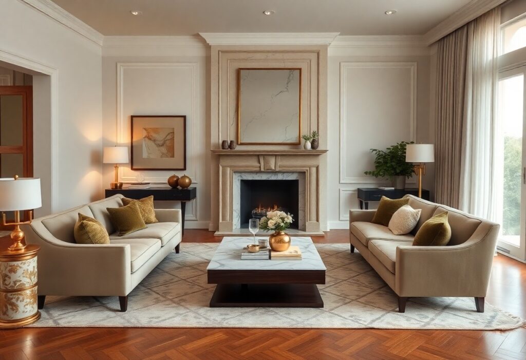
Most luxury homes I’ve designed rely on color not just for beauty, but to shape how you feel in a space. I use soft neutrals and rich tones to create deep comfort and effortless elegance. You don’t need bold hues-subtle contrasts and carefully layered palettes do more to elevate your experience of a room.
Key Takeaways:
- Luxury homes often use neutral color palettes-like soft whites, warm grays, and earthy beiges-to create a calm, timeless atmosphere that feels both inviting and refined.
- Strategic use of rich accent colors, such as deep navy, emerald green, or burgundy, adds depth and sophistication to key spaces without overwhelming the senses.
- Natural light and material tones are carefully considered; colors are chosen to harmonize with sunlight, wood finishes, and stone surfaces, enhancing comfort through balanced, organic cohesion.
The Luminous Grace of Pale Neutrals
I see how pale neutrals shape the soul of a luxury space-soft, light, and deeply calming. These tones don’t shout; they whisper refinement through every surface, allowing light to dance and rooms to breathe. You feel it the moment you step inside: a quiet elegance that wraps around you like morning light.
Champagne Whispers on Plastered Walls
Champagne tones on hand-troweled plaster add warmth without weight. I notice how they catch the sun at dusk, glowing with a subtle metallic grace that feels both rich and restrained. You’re not seeing paint-you’re sensing texture, light, and quiet opulence in a single glance.
The Cool Assurance of Alabaster
Alabaster brings a crisp, clean clarity to high-end interiors. I find its cool base balances warmer woods and metals beautifully. You experience a sense of order and calm, as this shade enhances natural light while grounding the room in timeless simplicity.
Alabaster isn’t just a color-it’s a design decision with quiet power. I’ve watched it transform spaces by making ceilings feel higher and walls recede, creating an airy sanctuary. When paired with natural stone or matte black fixtures, it delivers a striking contrast without drama. You get purity with presence, a backdrop that supports without overshadowing. This is the kind of detail that defines understated luxury.
Rich Pigments of the Jazz Age Legacy
I draw inspiration from the opulent hues of the 1920s, where deep tones set the stage for sophistication and allure. Royal indigo and verdant velvets echo the era’s bold elegance, transforming modern spaces into timeless retreats. Explore how these pigments live on in today’s luxury homes through Modern Elegance: Cutting-Edge Trends in Luxury Design.
Royal Indigo for the Stately Study
Indigo wraps your study in quiet authority, its depth calming the mind while signaling refinement. I use this shade to ground rich wood finishes and antique brass, creating a space where focus and comfort coexist. The color commands respect without sacrificing warmth, making it ideal for private reflection.
Verdant Velvets and Emerald Dreams
Velvet in lush green tones brings a tactile luxury to sitting rooms and bedrooms. I choose emerald to evoke nature’s serenity while adding a layer of opulence. This hue pairs beautifully with gold accents and natural light, making your space feel both grounded and radiant.
Emerald isn’t just a color-it’s an atmosphere. When I drape it across upholstery or paneling, it introduces a sense of sanctuary, as if your room is nestled in a private garden. The slight sheen of velvet catches daylight and lamplight alike, creating subtle movement and depth. It’s this quiet drama that makes verdant velvet unforgettable, turning ordinary interiors into curated experiences of calm and grandeur.
The Subtle Alchemy of Metallic Tints
I’ve watched how a whisper of metal in a finish can transform a room from static to alive. It’s not about shine for show-it’s the quiet depth that draws the eye without demanding attention. These tints work beneath the surface, enhancing texture and light in ways only felt, not always seen.
Burnished Gold in the Afternoon Sun
You’ll notice how burnished gold catches the low light, warming wood trims and mirror frames with a soft glow. It doesn’t shout luxury-it radiates it gently, syncing with natural sunlight to create moments of quiet opulence that feel personal, never staged.
Silver Refractions across Polished Marble
I see silver’s cool gleam dance across marble floors and countertops, subtly shifting with every change in light. This interplay adds a layer of dynamic elegance-a quiet sophistication that feels modern yet timeless underfoot.
What makes silver so effective on polished marble is its responsiveness. As daylight moves across the room, the metal’s reflection fractures into delicate patterns, like ripples on a still pond. I’ve stood in spaces where this effect turns a simple hallway into a gallery of light-each step altering the visual rhythm. The cool precision of silver balances warmer materials, grounding the space while lifting its presence.
Soft Shadows of the Twilight Suite
I find that twilight-inspired palettes in luxury bedrooms do more than set a mood-they shape the experience of rest. These spaces embrace dimmed luminosity, where walls seem to absorb light gently, creating a cocoon that quietly calms the senses and invites deeper relaxation.
Dove Gray for Restless Minds
You’ll notice how dove gray acts as a visual pause button in high-end retreats. I use it often in spaces meant for reflection because it neutralizes visual noise without feeling cold, offering a balanced backdrop that supports mental clarity and emotional ease.
Mauve Hues and Romantic Stillness
Mauve introduces a whisper of color that feels both intimate and refined. I’ve seen it transform master suites into sanctuaries where warmth and subtlety coexist-its soft blush undertones encourage emotional openness while maintaining a serene, collected atmosphere.
What makes mauve so effective in luxury design is its ability to blend sophistication with emotional warmth. I don’t treat it as just a color choice but as a psychological tool-its presence mimics the glow of candlelight at dusk, triggering a natural sense of safety and intimacy. When layered with textured linens or matte finishes, it deepens the feeling of being enveloped in quiet luxury, making it ideal for spaces where connection and calm are equally prized.
Earthly Tones of the Grand Estate
I find that grand estates often draw their soul from the land itself, using warm ochres, soft siennas, and muted umbers to ground the space in quiet dignity. These colors don’t shout-they settle, creating a backdrop where luxury feels lived-in, not staged. For deeper insight into how color shapes perception, explore Mariner | LUXURY Furniture, Lighting & Accessories.
Terracotta Rhythms in Open Courtyards
You’ll notice how terracotta tiles pulse with warmth underfoot, their irregular textures catching light like ancient stone. I see them as the heartbeat of open-air spaces-earthy, inviting, and subtly dynamic. These hues connect indoor luxury to the natural world, making outdoor living feel intimate and refined.
Deep Espresso and the Weight of Heritage
Deep espresso appears in carved beams, library paneling, and handcrafted cabinetry, carrying the gravity of legacy. I feel its presence immediately-a rich, almost solemn tone that speaks of decades, if not centuries, of quiet refinement. This is color as heirloom, not decoration.
When I study deep espresso in heritage homes, I’m struck by how it absorbs light rather than reflects it, creating rooms that feel sheltered and introspective. It’s not just a shade; it’s a statement of permanence. Paired with aged brass or ivory linen, it becomes a canvas for stories, where every scratch in the wood adds character. This is where comfort meets timelessness, and elegance feels earned, not imposed.
Conclusion
To wrap up, I’ve seen how luxury homes use colors to shape mood and perception. I choose soft neutrals and rich accents because they invite calm while adding refinement. You don’t need bold statements-your space can feel elegant and comforting through subtle, intentional palettes that reflect your taste and lifestyle.