
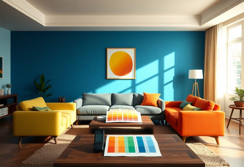
Colors shape how you feel every day, often without you realizing it. I’ve studied how specific hues influence emotions and behavior, and red can raise your heart rate, while blue promotes calm and focus. Your living space isn’t just a backdrop-it’s an active force. Choosing the right colors can reduce stress or boost energy, depending on your needs.
Key Takeaways:
- Warm colors like red, orange, and yellow can increase energy and stimulate conversation, making them ideal for social spaces such as living rooms and kitchens.
- Cool tones such as blue, green, and purple tend to lower heart rate and reduce stress, promoting relaxation in bedrooms and bathrooms.
- Personal experiences and cultural backgrounds shape how individuals respond to colors, meaning the emotional impact of a hue can vary significantly from person to person.
The Chromatic Blueprint
I’ve mapped how specific hues shape your daily emotions, and your walls do more than decorate-they influence behavior. I use color psychology to design spaces that calm or energize, depending on your needs. A bedroom painted in soft blue lowers heart rate, while a bold red in the dining area can spark conversation. Choosing the wrong tone can disrupt sleep or increase tension, so I always align each room’s palette with its purpose. You feel the difference before you even notice it.
The Azure Calm
I’ve noticed how just a hint of blue in your living space can shift your entire mood. Azure carries a quiet power-it slows your breathing, lowers your heart rate, and invites a sense of deep calm. You don’t need to paint every wall; even small accents can make a difference. I use throw pillows and artwork in soft ocean tones, and the effect is immediate. This color connects you to water and sky, both natural sources of peace. When stress builds, your eyes find that blue-and you exhale.
Solar Stimulation
I’ve noticed how sunlight paired with warm hues like golden yellow or terracotta can energize your mindset and sharpen focus. You don’t need full sun exposure-just the right color tones can mimic that effect. According to the Psychology of Color: How Shades Affect Your Mood, these shades trigger mental alertness. I recommend using them in spaces where you work or create.
Verdant Balance
I find that green spaces in your home do more than just please the eye-they restore mental clarity and reduce stress. This natural hue mimics the outdoors, bringing a sense of calm that supports focus and emotional balance. You don’t need a garden to benefit; even small touches of green can make a difference. Learn how colors impact mood and productivity in home design and see how simple changes can transform your environment.
Crimson Intensity
I feel the pulse of a room shift the moment crimson appears. You don’t just see this color-you experience it. It raises your heart rate, stirs passion, and can even sharpen focus. I’ve watched people become more animated in crimson-lit spaces, drawn into conversation like flames to oxygen. But too much can overwhelm, triggering anxiety or restlessness. I use it sparingly-a bold accent wall, a deep throw pillow-to harness its energy without surrendering to it.
The Neutral Anchor
I rely on neutral tones to ground a room’s emotional impact. You might overlook beige or gray as dull, but they create balance and give your mind space to breathe. I’ve seen how these shades absorb stronger colors, preventing sensory overload. When used wisely, neutrals become the quiet force that stabilizes your entire environment.
To wrap up
Now I’ve shown you how colors influence your mood through real psychological and physiological responses. I see how your living space isn’t just a visual backdrop-it actively shapes how you feel every day. By choosing the right hues, you can create environments that calm, energize, or inspire you, all backed by science.