
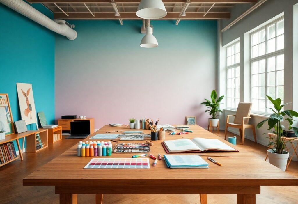
Most people underestimate how deeply color impacts your mindset, but I’ve seen firsthand how the right hues transform dull rooms into idea factories. I use bold yellows to ignite energy and calm blues to deepen focus-both proven to boost creative output. You don’t need a redesign; just one strategic accent wall can shift your thinking.
Key Takeaways:
- Warm hues like yellow and orange can stimulate mental activity and encourage innovative thinking, making them effective choices for creative workspaces.
- Soft blues and greens promote calm focus, helping individuals stay open to new ideas without feeling overwhelmed or distracted.
- Personal color preferences play a major role in inspiration-designing with individual emotional responses to color leads to more authentic and productive environments.
The Soul of the Spectrum
I’ve found that color does more than decorate-it shapes thought. Your environment speaks to your subconscious, and the right hues can unlock deeper focus or spark unexpected ideas. I don’t just choose shades for aesthetics; I use them as tools to influence mood, energy, and creative flow in every space I design.
Azure Vistas for the Wandering Mind
Blue pulls your thoughts beyond the immediate, opening mental horizons like a clear sky over open terrain. I use soft azure tones to quiet mental noise and invite contemplation, helping you drift into imaginative spaces without distraction or fatigue.
The Gallant Charm of Ochre
Ochre warms a room with quiet confidence, grounding your creativity in earthy resilience. I see how this golden hue awakens curiosity without overstimulating, offering a balanced energy that supports sustained, thoughtful work.
I’ve watched clients sit in ochre-walled studios and begin to speak more freely, their ideas unfolding with greater warmth and clarity. This isn’t just a color of comfort-it carries a subtle boldness, a historical depth drawn from cave paintings and ancient textiles, that connects you to generations of storytellers. When you surround yourself with ochre, you’re not just painting a wall-you’re honoring a legacy of creation.
The Drama of Chromatic Tension
I’ve found that opposing colors don’t just contrast-they converse. When you place bold red beside deep green or electric blue against burnt orange, energy sparks in the space between. This chromatic tension doesn’t overwhelm; it wakes the mind, urging you to look closer, think deeper, and respond.
Brilliant Strokes Against the Mundane
Color shocks the ordinary into relevance. I often introduce a single vibrant wall or a painted door in an otherwise neutral room because that surprise ignites curiosity. You don’t need excess-just one fearless stroke to disrupt the expected and invite creative thought.
The Wit of Darker Hues
Darker tones aren’t oppressive-they’re perceptive. I use deep navy, charcoal, or forest green to ground a space, proving that shadow can sharpen insight as much as light. These hues create intimacy, making you lean in, listen closer, and think more deliberately.
What most overlook is how darker hues command attention through restraint. I’ve watched clients grow more focused in rooms wrapped in moody tones-the absence of glare reduces distraction, while the depth of color adds emotional resonance. Black isn’t an end; it’s a pause that amplifies what comes next. When balanced with texture or a single bright accent, these shades become thinking spaces, not hiding places. You begin to see nuance, not just shade.
Nature as the Supreme Decorator
I find that the most inspiring spaces mirror the organic balance found outdoors. Earth tones, natural light, and living elements quietly awaken the mind. For those seeking hues that stimulate inventive thinking, Best Room Colors for Creativity – 10 Creative Paint Color … collection I rely on for fresh inspiration.
The Unblemished Virtue of White
White offers a clean beginning, a canvas free of distraction. I find it helps you focus on form and light, making ideas feel sharper. When used thoughtfully, it brings clarity and calm without sterility, letting your work take center stage.
Scarlet Rhythms for Bold Endeavors
Scarlet pulses with energy, triggering urgency and passion in your process. I’ve noticed it sharpens focus during high-intensity tasks. This color isn’t for every wall, but as an accent, it delivers a powerful emotional charge that fuels daring ideas.
When I use scarlet in a studio, I limit it to a single wall or small design elements-too much can become overwhelming. It stimulates the nervous system, which is excellent when you need to push through creative blocks. The key is balance: pair it with neutral tones to ground its intensity. I’ve seen artists produce their most daring work in spaces where scarlet appears just at eye level, creating a subtle but constant spark. Its psychological impact is undeniably strong, making it a strategic choice, not just a stylistic one.
The Alchemy of Light
I’ve learned that light doesn’t just reveal color-it transforms it. The same wall can whisper inspiration or shout monotony depending on the hour. You feel it in your bones when the right glow hits the right hue, awakening a quiet energy that pulls ideas from stillness. This is where creativity begins-not in permanence, but in change.
Morning Gilt and Chromatic Truth
Each dawn, I watch how sunlight gilds cool blues and soft yellows, turning them into signals of clarity. You’ll notice how these tones, under morning’s clean beam, expose chromatic honesty-no shadows to hide behind. This is the moment your mind sharpens, ready to sketch, write, or rethink.
The Velvet Grace of Evening
As dusk settles, I see how deep burgundies and muted teals absorb the fading light, becoming richer, more introspective. You’re drawn inward now, where ideas simmer instead of spark. This is the most dangerous time for creativity-not because it lacks energy, but because it tempts you to stop too soon.
When evening wraps the room in its hush, I don’t reach for brights. Instead, I lean into the dim, letting low-lit surfaces deepen into emotional resonance. The colors don’t shout; they suggest. You start hearing nuances in your own thoughts, the kind that lead to breakthroughs-if you’re still enough to listen. It’s here, in this quiet alchemy, that true creative transformation takes root.
Summing up
Drawing together years of observation and design practice, I’ve found that colors like warm yellows, deep blues, and earthy greens consistently spark imagination in your spaces. I see how the right palette influences mood and focus, turning walls into quiet collaborators in your creative process. You don’t need bold statements-just thoughtful choices that align with how you think and work.