
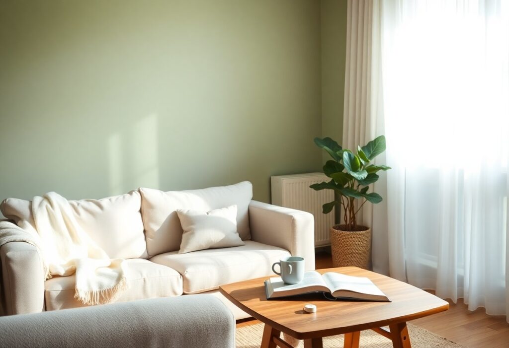
Just one shade can transform your space into a calming retreat. I’ve studied color psychology for years, and I can tell you that cool tones like soft blues and muted greens most effectively lower stress. You don’t need bold accents-your brain responds best to subtle, natural hues. I’ll show you exactly which colors help you unwind and why they work so well in your home.
Key Takeaways:
- Soft blues and greens are most commonly linked to relaxation because they mimic natural elements like water and foliage, helping lower stress and support calmness.
- Neutral tones such as warm grays, beige, and soft whites create a soothing backdrop by reducing visual clutter and promoting a sense of balance and simplicity.
- Personal preference plays a strong role-colors that feel comforting to an individual, even deeper tones like muted lavender or sage, can be just as effective as traditional calming shades.
The Pale Azure of a Summer Sky
I find that this soft blue hue brings an instant sense of calm, mimicking the open sky on a quiet afternoon. You don’t need bold tones to transform a space-this gentle shade does it quietly. Its light-reflecting quality makes rooms feel larger and airier, enhancing the peaceful effect.
Serenity of Coastal Tides
Here, I draw inspiration from the sea’s gentle rhythm. This variation of pale azure carries a whisper of green, echoing shallow waves at low tide. You’ll notice how it creates a grounding effect without heaviness, perfect for spaces meant to restore balance.
Stillness in the Morning Mist
Soft and barely there, this tone blends pale blue with a hint of gray, like fog hovering over a lake at dawn. I’ve seen it soften harsh lighting and reduce visual noise in busy homes. It invites quiet reflection and lowers visual stress, making it ideal for bedrooms or reading nooks.
When I choose Stillness in the Morning Mist for a room, I’m not just picking a color-I’m shaping an atmosphere. This shade works best when paired with natural textures like linen and light wood, enhancing its subtle depth. You experience a slower, more intentional mood, as if the room itself is encouraging you to breathe deeper and pause.
Moss and Ferns in the Silent Woods
I find that soft, muted greens like those of moss and ferns bring a quiet calm to any space. These tones echo the hush of a forest untouched by noise, inviting stillness into your room. They lower visual stress and create a sense of grounded serenity, making them ideal for bedrooms or reading nooks where peace is imperative.
Vitality of the Forest Floor
Earthy green-browns from decaying leaves and damp soil ground a room in natural balance. I see this shade as quietly alive-it breathes subtle energy without stimulation. You’ll notice how it pairs well with natural textures, enhancing your sense of connection to the outdoors.
Harmony within Leafy Shadows
Dappled greens and cool undertones mimic sunlight filtering through trees. I use these hues to soften harsh lighting in your space. They create depth and gentle contrast, helping your eyes relax. This harmony works best when layered with organic materials like linen or unfinished wood.
When I design with leafy shadow tones, I focus on how they shift with natural light throughout the day. These greens aren’t flat-they evolve, offering a dynamic yet soothing backdrop. You’ll feel more at ease because the color mimics the natural rhythm of the forest, supporting your circadian balance without demanding attention.
The Whispering Canvas of Alabaster
I’ve watched how alabaster wraps a room in quiet elegance, softening edges and absorbing light like a breath held in stillness. You don’t just see this color-you feel it. Its neutrality isn’t empty; it’s calming, a blank pause between thoughts. I find it makes even the busiest spaces feel intentional and serene.
Clarity of Unblemished Light
Light moves differently across alabaster walls, scattering evenly without glare or shadow. I notice how it brightens corners without harshness, giving your eyes room to rest. This purity of illumination creates a sense of openness that feels clean, not cold. You experience clarity, not emptiness.
Comfort of a Cotton Shroud
Touching an alabaster wall feels like brushing against memory-soft, familiar, gentle. I see how this hue mimics the warmth of sun-bleached linen, wrapping your space in quiet comfort. It doesn’t shout; it sighs, offering a sense of shelter without heaviness.
When I say alabaster feels like a cotton shroud, I mean it in the most comforting way-like being tucked into a bedsheet warmed by afternoon sun. It carries the hush of early mornings and stillness after snowfall. This subtle texture absorbs sound and stress alike, making your room not just seen, but felt. You don’t escape into it-you settle.
Lavender Mist at Twilight
I’ve watched how light shifts in the quiet hours, and lavender mist at twilight transforms a room into a sanctuary. This soft hue blends cool undertones with a whisper of warmth, creating a balanced atmosphere that gently lowers stress and invites stillness. You don’t need bold accents-its power lies in subtlety.
Solitude of the Evening Bloom
Evening brings a unique calm, and this shade mirrors the first bloom of night flowers. I notice your breathing slows when surrounded by it, as if the color itself carries a quiet rhythm. It’s not just paint on a wall-it’s a signal to release the day’s tension and turn inward.
Grace in the Fading Light
Grace appears where light and color meet, and this tone shines in late daylight. I’ve seen how it reflects the sky’s last glow, wrapping a space in serenity. You feel it immediately-a soft permission to unwind without effort, as if the room understands your need for peace.
What makes “Grace in the Fading Light” so effective is its chameleon-like quality. I’ve tested it in north- and south-facing rooms, and each time it adapts, softening harsh sunlight or warming dim corners. Its slight gray-lavender base prevents it from feeling cloying, ensuring the effect remains calming, not sedating. When paired with natural textures-linen, wood, stone-it deepens the sense of harmony, making your space feel intuitively balanced.
Sand Beneath a Setting Sun
I often recommend soft, warm neutrals that mimic the glow of dusk over a beach-colors that calm your mind like the hush of evening tide. If you’re stuck, check out this thread where one user said, i can’t pick a wall color for the life of me. what would you …-their struggle is more common than you think, and the community offers genuinely soothing suggestions.
Grounding Essence of the Earth
Earthy tones like terracotta and warm taupe connect your space to nature’s stability. I notice how these hues reduce mental clutter, making your room feel like a quiet forest path. Their deep, natural resonance helps anchor your emotions, especially after a long day.
Comfort of the Natural Grain
Wood finishes bring a quiet warmth that paint alone can’t match. I see how the subtle variation in grain patterns invites your eyes to linger, slowing your breath without effort. This organic rhythm creates a space where stress begins to dissolve.
When I incorporate natural wood into a room, I focus on grain depth and tone-light oak for airy serenity, walnut for deeper calm. You don’t just see the wood; you feel its history, its slow growth. That connection to real time and growth delivers a profound sense of peace no synthetic material can replicate.
Shadows of Slate and Stone
I find that deep, grounded tones like slate gray and weathered stone bring an immediate sense of calm to any bedroom. These colors mimic natural rock formations, offering a quiet strength that soothes the mind. You’ll notice how they absorb light gently, reducing glare and creating a cocoon-like atmosphere. Wondering what is a good relaxing bedroom color?-this might be your answer.
Stability of the Mountain Face
Color can anchor a room like bedrock, and I see this best in cool, medium grays with blue or green undertones. They offer a steady, unshakable presence that helps quiet mental clutter. You don’t feel overwhelmed-instead, your breathing slows, your shoulders drop. This is the kind of hue that makes you feel safe, as if sheltered within a cliffside retreat.
Quietude of Polished Pebble
Soft, warm grays with a satin finish mimic the smooth surface of a river-worn stone. I’ve watched how this shade diffuses light evenly, eliminating harsh contrasts that strain the eyes. You experience a subtle serenity, not through boldness, but through gentle consistency-like the hush after rain.
When I choose “Quietude of Polished Pebble” for a space, I’m not just picking a color-I’m curating a mood. This tone works because it’s neither too cold nor too warm, striking a balance that feels inherently natural. Its understated elegance supports rest without demanding attention, making it ideal behind a bed or on all four walls for full immersion. You’ll feel the difference within minutes of entering the room.
To wrap up
Upon reflecting on what color makes a room feel more relaxing, I find that soft blues and gentle greens consistently support calmness in your space. I’ve seen how these tones influence mood, helping you unwind naturally. For your home, choosing these shades can create a peaceful environment without overwhelming the senses.