
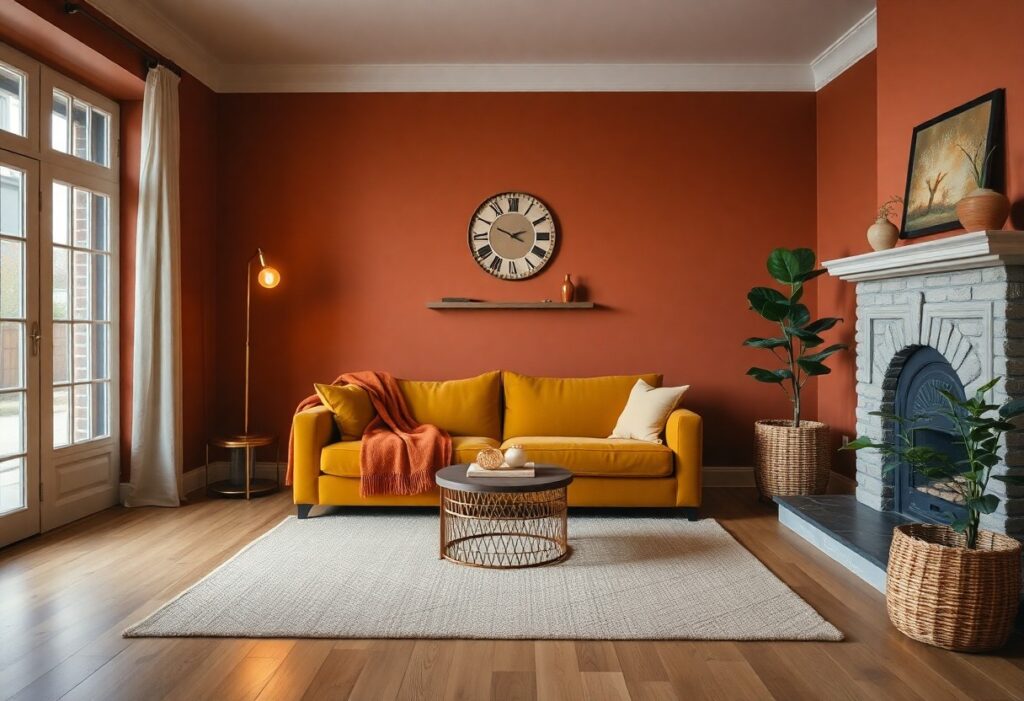
There’s a powerful connection between color and emotion in your home. I’ve found that warm tones like terracotta, creamy beige, and deep mustard can instantly make your space feel inviting. The right shade doesn’t just enhance comfort-it can transform how you experience every room. Let me show you which colors work best.
Key Takeaways:
- Warm neutrals like beige, cream, and warm gray create a welcoming atmosphere by reflecting soft light and pairing easily with natural materials like wood and stone.
- Earthy tones such as terracotta, olive green, and deep rust add depth and comfort, bringing a sense of nature indoors and enhancing a room’s coziness.
- Rich accent colors like deep burgundy, chocolate brown, or navy can make spaces feel intimate and snug when used on walls, in textiles, or through furniture choices.
The Soil Beneath Our Feet
I find that grounding a home’s palette in earth-inspired tones brings an instant sense of warmth. Colors pulled from the soil-rich browns, burnt siennas, and soft umbers-create a foundation that feels naturally inviting. These shades absorb light gently, making rooms feel sheltered and intimate, just like nature intended.
Terracotta and Clay
You’ll notice how terracotta warms a space without overwhelming it. This reddish-brown hue, drawn straight from sun-baked earth, radiates gentle heat and pairs beautifully with natural wood and woven textiles. I use it in living rooms and kitchens where comfort matters most.
Moss and Sage
Green is often overlooked in cozy palettes, but moss and sage bring a calming depth that feels alive. I love how these tones mimic forest floors after rain-soft, cool, yet deeply comforting. They work especially well in bedrooms and reading nooks.
When I choose moss or sage for a wall, I see how quickly the room transforms into a quiet retreat. These greens aren’t just neutral-they’re nurturing. Paired with creamy whites or warm grays, they create a space that breathes. The subtle coolness of sage balances warmer wood tones, preventing a room from feeling too heavy while still maintaining that imperative sense of warmth.
The Fireplace Spirit
I’ve always believed the fireplace is the soul of a cozy home, and the colors you choose around it can either amplify or dull its warmth. Rich, earthy tones pull heat into the room visually, making cold walls feel inviting. You don’t need a fire lit to feel its presence when your palette echoes glowing embers and smoldering logs.
Deep Crimson
I see deep crimson as the heartbeat of a warm room-it pulses with quiet energy. This shade wraps your space in a sense of shelter, like being tucked under a wool blanket on a winter night. Used on an accent wall or in textiles, it adds depth without overwhelming, especially when balanced with neutral tones.
Burnt Amber
I find burnt amber captures the exact moment sunlight hits a flickering flame. It’s warm without being loud, bringing a soft radiance to walls and trim. When you pair it with natural wood or cream fabrics, the effect is instantly comforting and grounded, like the room itself is breathing gently.
What makes burnt amber truly special is how it shifts with the light. In the morning, it glows softly, almost honey-like, while in the evening, it deepens into something richer, more intimate. I’ve used it in living rooms and entryways where I want people to pause and feel settled. Unlike bolder reds or oranges, it doesn’t dominate-instead, it supports your sense of calm while enhancing warmth through subtle, organic energy.
Golden Simplicity
I find that soft, sun-kissed tones like harvest wheat bring an effortless warmth to any space. These shades mimic the glow of late afternoon light, making rooms feel inviting without overwhelming them. For inspiration on how warm colors transform interiors, check out this curated collection: Warm Colors: 31 Rooms That Showcase the Coziness of ….
Harvest Wheat
Harvest wheat wraps your walls in a gentle, earthy embrace. I love how this muted gold works with natural wood and linen textures to create a grounded, calming atmosphere. It’s not just a color-it’s a mood, one that says you’re home the moment you walk in.
Honeyed Pine
Honeyed pine adds depth with its warm undertones and subtle shimmer. I’ve seen it turn ordinary rooms into cozy retreats, especially when paired with soft lighting. This shade brings a luminous warmth that feels welcoming year-round.
When I use honeyed pine in a space, I notice how it interacts beautifully with both modern and rustic elements. It has a quiet richness that doesn’t shout, yet commands attention through its depth and warmth. Whether on walls or cabinetry, this hue enhances wood finishes and soft textiles, making your home feel more intimate and layered. It’s one of my go-to choices for creating a lived-in, comforting vibe.
Enveloping Shadows
I find that deep, grounding tones like charcoal and obsidian create a sense of intimacy no light wall ever could. When you surround yourself with these rich hues, the room feels like a protective embrace. Explore how warmth isn’t always bright with The Return of Warm Colors to Interior Design: a cozy and vibrant trend.
Slate and Stone
You’ll notice how slate gray and stone tones bring quiet elegance to a space. These colors mimic natural materials, adding texture without overwhelming. I use them in living rooms and entryways where I want calm to settle in early and stay late.
Navy Solitude
Navy pulls the room inward, creating a cocoon of calm. I’ve seen how this shade transforms bedrooms into retreats, where even the air feels quieter. It’s not just dark-it’s deeply comforting.
What makes navy so effective is its ability to absorb light rather than reflect it, giving your eyes a place to rest. I paint accent walls in this hue when I want depth without heaviness. Unlike black, navy carries warmth in its undertones, making it ideal for spaces where you seek stillness. It’s the color of night without the chill, and when paired with soft linen or warm wood, it becomes a backdrop for true relaxation.
Summing up
On the whole, I find that warm neutrals like beige and taupe, along with earthy tones such as terracotta and olive green, make your house feel warm and cozy. I’ve seen how soft reds and creamy whites add comfort and depth. You don’t need bold contrasts-gentle, natural hues often create the most inviting spaces.