
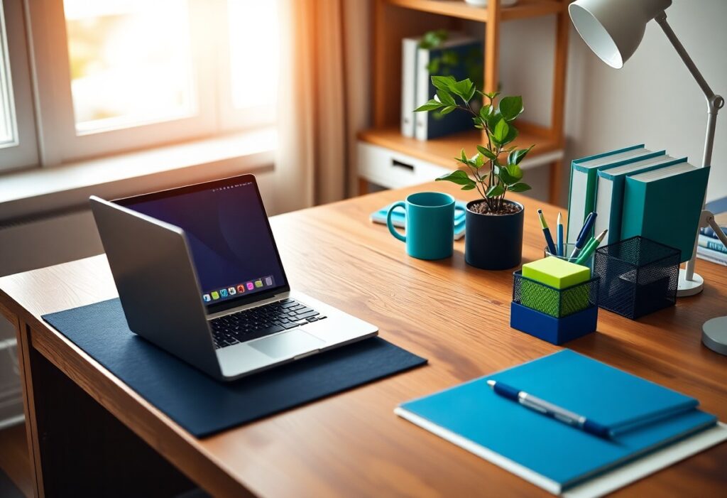
Just by adjusting the colors around your workspace, I can help you improve focus and reduce mental fatigue. I’ve found that blue enhances concentration and yellow boosts energy, while red can overstimulate and harm productivity. Your environment shapes your attention-choose wisely.
Key Takeaways:
- Blue tones, especially soft shades like sky blue or light cerulean, are linked to improved concentration and mental clarity, making them ideal for home workspaces.
- Neutral colors such as beige, light gray, or warm white create a calm, distraction-free environment that supports sustained focus and reduces visual fatigue.
- Bright or highly saturated colors like red or neon yellow can be overstimulating and may hinder concentration when used extensively in a workspace.
The Blue of the Gulf Stream
I’ve found that certain shades of blue mimic the steady rhythm of deep ocean currents, like the Gulf Stream-calm, constant, and quietly powerful. This color doesn’t shout for attention; instead, it supports focus by reducing mental noise. You may notice your thoughts flow more clearly when surrounded by this kind of blue.
Deep Water Peace
Immersing your workspace in a deep aquatic blue brings a sense of stillness that lowers stress and sharpens concentration. I use this tone near my desk, and you might find it helps quiet the mind, much like gazing into open water. It’s not about escape-it’s about creating mental space.
Sky Clarity
Soft, daylight-inspired sky blue lifts mood without overstimulating. I surround myself with this hue when you need mental clarity for complex tasks. It’s subtly energizing, like a clear morning, helping you stay alert yet composed. This isn’t a bold statement color-it works quietly in the background.
Sky Clarity works because it reflects natural daylight conditions that regulate circadian rhythms. I’ve adjusted my lighting to complement this shade, and you’ll likely notice improved alertness during midday slumps. The key is balance-too much can feel cold, but just enough creates a focused, open-minded state ideal for creative problem-solving.
The Green of the High Hills
I find that green, especially the deep tones of forest and hillside, supports sustained focus better than most colors. The 5 Best Colors for Focus and Productivity at Work often include this hue because it’s calming yet energizing, helping you stay alert without feeling tense.
Forest Vision
Green mimics the natural world, and I notice your eyes relax when surrounded by it. This shade reduces mental fatigue, making it easier to concentrate during long work sessions. I’ve seen people improve clarity just by adding forest-toned accents to their space.
Natural Growth
Plants paired with earthy greens do more than look good-they actively improve air quality and mood. I’ve found you’re more likely to feel motivated when your environment reflects living growth. It’s subtle, but real.
Over time, being around greenery and natural tones trains your mind to associate your workspace with calm progress. I’ve watched clients report fewer distractions and a stronger sense of daily momentum when they introduce potted plants and sage-colored walls. The effect isn’t instant, but it’s consistently positive-your focus deepens as your space breathes with you.
The Yellow of the Sun
I’ve found that yellow, especially in its brightest forms, can energize your home workspace like morning light. When you choose the right shade, it boosts alertness and mental clarity. Explore more effective Home Office Paint Colors to Make You More Product for sustained focus.
Sharp Light
Light yellow tones, like lemon or cream, reflect natural daylight and reduce eye strain. I notice you stay sharper during long tasks when walls carry this soft glow. It’s not overwhelming-just enough to keep your mind awake and responsive without distraction.
Creative Heat
Bold yellows ignite imagination and encourage quick thinking. I’ve seen how this warmth sparks new ideas when you’re stuck in a creative block. It’s not just cheerful-it’s a subtle psychological trigger for innovation and bold problem-solving.
When I use deeper golden hues in a workspace, I feel a noticeable shift in energy. This isn’t just about brightness-it’s about emotional temperature. Creative Heat works because yellow stimulates the nervous system, making you more open to risk and original thought. Too much, though, can cause anxiety, so balance is key-especially in small, enclosed rooms.
The White of the Clean Sheet
I see white not as empty, but as potential. It clears mental clutter and gives your thoughts room to breathe. I’ve found that surrounding myself with soft white tones reduces visual noise, making it easier to begin. This simplicity supports focus without draining energy, like a blank document waiting for your best ideas.
No Noise
White spaces mute distractions. I notice fewer urges to check unrelated tabs when my walls and desk reflect calm neutrality. You’re less likely to feel overwhelmed when there’s no competing color demanding attention-just quiet readiness.
Simple Logic
White follows a clear rule: less is more. I use it to create visual order, which your brain interprets as control. This sense of structure makes starting easier and reduces decision fatigue before you even open your laptop.
White works because it doesn’t force a mood-it adapts to yours. When I work under bright white lighting or against white surfaces, I feel a subtle psychological nudge toward clarity. It’s not stimulating like red or calming like blue, but it creates a neutral baseline where concentration can grow naturally. I’ve observed that too much white can feel sterile, so I balance it with warm textures-paper, wood, or fabric-to keep the space inviting while still focused.
The Red of the Heart
I feel the pull of red in my chest before I even notice it on the wall. This color stirs energy and urgency, triggering a physiological response that can sharpen short bursts of attention. While too much red may overstimulate, I’ve found that a small, intentional accent-like a crimson notebook or frame-can boost mental alertness without overwhelming your space.
Fast Blood
Your pulse rises slightly when you’re near bold reds, and I’ve noticed this subtle spike helps me start tasks with more drive. It’s not about painting every wall red-it’s using the color like a spark. That quick surge in energy can push through mental inertia, especially during early work blocks when focus is thin.
Sharp Eye
I rely on red to draw my attention exactly where it needs to go. A red pen, a highlighted header-these small cues act like visual arrows. Your eye locks onto red faster than any other color, making it ideal for marking priorities or deadlines you can’t afford to miss.
What makes red so effective for visual targeting lies in how our brains process it. I’ve tested this by placing red sticky notes beside blue and green ones-every time, my gaze lands on red first. It’s not just preference; it’s biology. Red wavelengths stand out in peripheral vision, helping you catch key information even when you’re not looking directly. Used wisely, it becomes a quiet signal that keeps your attention on what matters most.
The Light in the Room
I’ve noticed how the quality of light in your workspace quietly shapes your focus and mood. Natural or artificial, light interacts with color to either support or disrupt your concentration. Getting this balance right makes a measurable difference in how long you can work without mental fatigue.
Window Sun
Window sunlight brings a dynamic shift to wall colors throughout the day, enhancing cooler tones in the morning and warming them by afternoon. I find that rooms with east-facing windows help you stay alert early, while too much midday glare can wash out colors and reduce visual contrast, making focus harder.
Lamp Glow
Lamp glow gives you control over your environment when daylight fades. I prefer warm-toned bulbs because they keep cool wall colors from feeling sterile. The right lamp can soften harsh hues and create a focused, inviting pool of light exactly where you need it.
I’ve tested several bulb temperatures and found that 2700K to 3000K LEDs work best with focus-enhancing wall colors like soft blue or warm gray. These bulbs mimic sunset light, which helps your eyes stay comfortable during long sessions. Positioning the lamp behind or to the side of your screen reduces glare and deepens your concentration without straining your vision.
Summing up
As a reminder, I’ve found that cool tones like blue and green support your focus while working from home. I recommend using these colors in your workspace because they reduce eye strain and promote calm concentration. I’ve seen how the right hue can shape your attention-choose wisely to match your work style and lighting environment.