
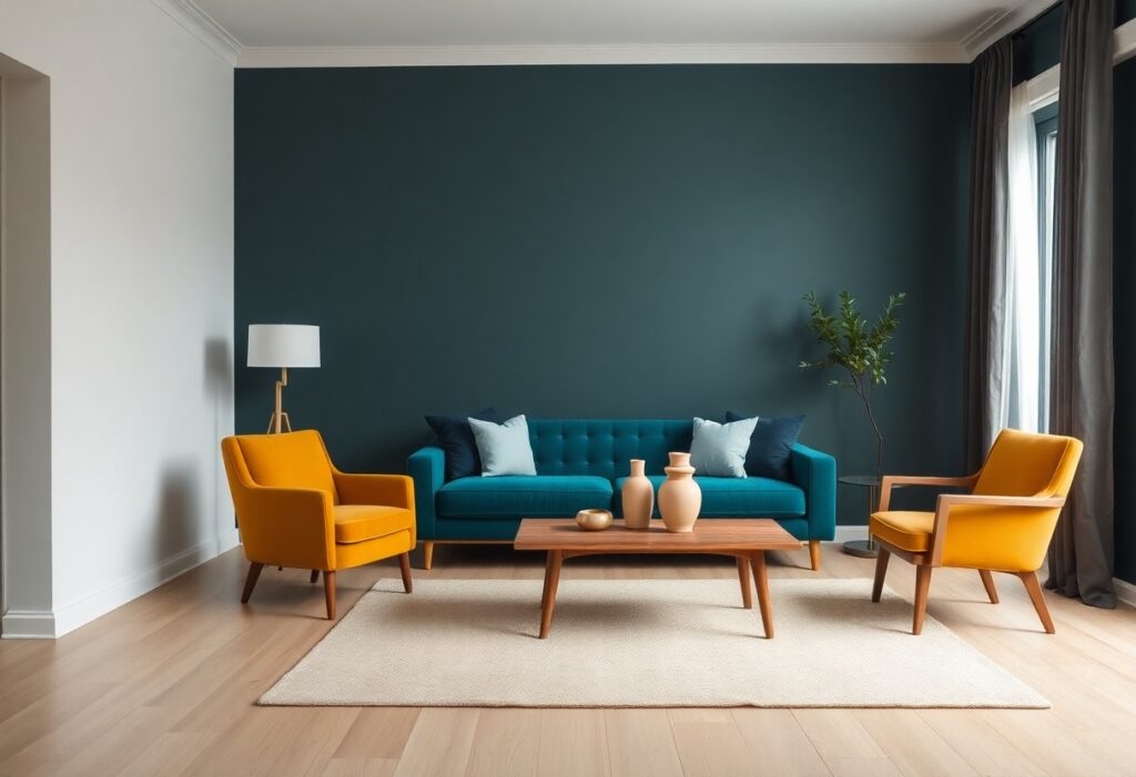
Most people fear bold colors will overwhelm their space, but I’ve found that strategic balance transforms energy into harmony. I use one dominant hue, support it with complementary accents, and anchor everything with neutral tones. You don’t need to shy away from vibrancy-your confidence in color defines the room’s mood, not the number of shades you choose.
Key Takeaways:
- Use a dominant bold color and let one or two others play supporting roles to create balance instead of visual chaos.
- Space colors apart with neutral elements like white walls, wood furniture, or black accents to give the eye resting points.
- Stick to a limited palette of three bold hues or fewer, and repeat them in consistent proportions throughout the room for cohesion.
The Mathematical Elegance of Ratios
I rely on ratios to keep bold colors balanced and intentional. A 60-30-10 rule gives structure: 60% dominant hue, 30% secondary, 10% accent. This framework prevents chaos while allowing drama. You don’t need symmetry to feel harmony-just proportion.
The Dominance of the Primary Shade
Your main color sets the room’s emotional tone and should appear in large elements like walls or sofas. I choose one bold shade to lead, ensuring it anchors the space without overwhelming. This single focal point gives the eye a place to rest amid vibrancy.
The Graceful Support of Secondary Tones
Secondary colors complement the primary without competing. I use them in textiles, chairs, or art to add depth. These tones soften transitions and create rhythm, making bold choices feel considered, not chaotic.
What makes secondary tones truly effective is their ability to echo the primary shade while introducing contrast. I often pick hues from the same color family but in different saturations-like pairing cobalt with teal or rust with terracotta. When you repeat these in small, deliberate doses, they build cohesion without monotony. It’s not about hiding boldness, but guiding it.
The Necessity of Silent Spaces
I believe every bold color story needs room to breathe. Without silent spaces, even the most thoughtful palette can overwhelm. I use open walls, uncluttered surfaces, and minimal decor to give the eye a rest. These pauses are just as expressive as color itself, allowing your space to feel dynamic yet balanced.
Utilizing Whites and Creams
You’ll find that whites and creams act as natural reset buttons in a colorful room. I use them on trim, ceilings, or large furniture pieces to soften contrasts and create visual relief. These tones aren’t passive-they actively shape how your bold hues are perceived, making them feel intentional, not chaotic.
The Grounding Influence of Natural Wood
Wood brings warmth that synthetic materials can’t replicate. I rely on natural wood in flooring, furniture, or shelving to anchor vibrant colors and prevent them from floating aimlessly. Its organic texture adds depth without competing, making your palette feel rooted and harmonious.
When I incorporate natural wood, I focus on grain and tone rather than finish perfection. A reclaimed oak table or a walnut shelf introduces subtle variation that softens the impact of bold walls or furnishings. Unlike painted surfaces, wood ages gracefully, evolving alongside your color choices and adding enduring character to your space.
Texture as a Diplomat
I use texture to calm bold color clashes and create harmony in unexpected pairings. By introducing materials that catch light differently, I give your eyes a resting point amid vibrant hues. How to Mix Patterns in Interior Design Without Creating … shows how pattern and texture work together to prevent visual chaos while keeping energy alive.
Softening Vibrancy with Velvet
Velvet absorbs light, instantly grounding bright tones with its plush depth. I often choose a jewel-toned velvet chair in a high-impact space because it adds richness without amplifying noise. This subtle contrast keeps your bold choices feeling luxurious, not overwhelming.
Adding Depth through Woven Fabrics
Woven textiles like bouclé or hemp add organic variation that breaks up solid color blocks. I rely on them to introduce quiet movement in a scheme dominated by strong pigments. Their natural irregularities make the space feel lived-in and balanced, not staged.
When I layer in woven fabrics, I’m not just adding texture-I’m creating micro-shadows and tonal shifts that evolve with the light. A handwoven throw or a seagrass rug introduces subtle contrast, allowing bold walls or furniture to feel intentional rather than aggressive. These materials bring an earthy counterpoint, making the room feel grounded even when colors pop. I find this approach delivers the most authentic sense of calm in a vibrant space.
The Illumination of Intent
Lighting shapes how your bold color choices are perceived, and I always use it to guide the mood. How to incorporate bold colors without overwhelming the space often comes down to balance-and that starts with illumination. Learn more from this discussion on Quora where designers share real-life solutions.
Soft Lighting to Muffle Noise
Light wrapped in fabric or diffused through frosted glass softens the visual impact of vibrant walls. I find that warm, low-level lighting takes the edge off intense hues, making them feel inviting instead of loud. This subtle glow keeps energy in check without sacrificing personality.
Strategic Shadows for Depth
Shadows add dimension when bold colors risk flattening a room’s appearance. I place directional lights to cast gentle shadows behind furniture or artwork, creating pockets of calm. These quiet zones give the eye room to rest, preventing visual fatigue.
When I design with strong color, I treat shadows as active design elements, not just absences of light. By angling sconces or using floor lamps with focused beams, I sculpt space and draw attention where it belongs. A well-placed shadow can ground a bright wall or highlight texture in a bold accent piece, turning potential chaos into curated drama.
The Art of the Accent
I use bold colors to energize a space, but only where they’ll have maximum impact. You don’t need color on every wall to make a statement-sometimes a single painted nook or a vivid piece of furniture does more. The key is restraint: one bold move, well executed, creates focus instead of chaos.
The Singular Statement Piece
A single vibrant sofa or an intense artwork can define a room without overwhelming it. I choose one hero item in a saturated hue and let everything else support it. This prevents competition and gives your eye a natural resting point.
Precision in Placement
Positioning matters more than color choice. I place bold elements where they’ll draw attention naturally-like at the end of a hallway or opposite a doorway. Strategic location turns chaos into intention.
When I place a bold chair in an empty corner, it doesn’t just add color-it creates purpose. You’ll want to consider sightlines and flow; a red lamp on a side table only works if it’s seen in context. Too close to another bright object, and harmony breaks. I keep distance between accents so each breathes. Your room should guide the eye, not scatter it.
To wrap up
Conclusively, I balance bold colors by anchoring them with neutral tones, using a dominant hue to guide your eye, and limiting the palette to three strong shades. I recommend testing swatches in your actual light and spacing colors with white or gray to keep your space feeling intentional, not chaotic.