
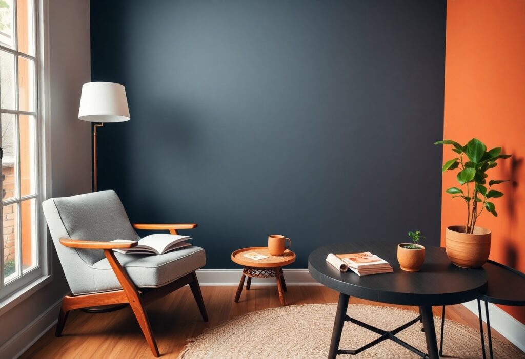
Over years of designing calming interior spaces, I’ve found that your reading corner’s color directly impacts focus and relaxation. I recommend soft neutrals or muted blues because they reduce eye strain and create a peaceful atmosphere. Bright or overly warm tones can be dangerously overstimulating, making long reading sessions uncomfortable. I always advise you to prioritize emotional comfort over trends.
Key Takeaways:
- Soft, warm neutrals like beige, warm gray, or creamy white create a calming atmosphere that supports focus and relaxation during reading.
- Accent colors such as muted blue or sage green can enhance concentration and bring a sense of tranquility to the space.
- Personal preference matters-choose a color that feels inviting to you, since comfort encourages longer, more enjoyable reading sessions.
The Luminous Whisper of Pale Blue
I’ve found that pale blue wraps a reading corner in calm, like morning light filtering through gauzy curtains. You don’t just see it-you feel it settle over your thoughts. This soft hue lowers visual noise, making it easier to sink into a novel or journal with clarity and ease.
Finding stillness in the ether
Stillness isn’t empty-it’s full of breath, and pale blue holds that space beautifully. I notice how it pulls the sky indoors, giving your mind room to drift without distraction. You’re not just reading; you’re pausing inside a quiet moment that feels both light and deeply centered.
How cool shades quiet the pulse
Cool tones like pale blue slow your breathing without you realizing it. I’ve watched people sit down restless and grow still within minutes. Your nervous system responds before your mind catches up, making this shade a silent ally for focus and emotional balance during long reading sessions.
What makes cool shades so effective isn’t just aesthetics-it’s physiology. I pay attention to how pale blue reduces eye strain under lamplight, especially in the evening. It reflects just enough light to keep the space inviting, but not so much that it disrupts melatonin. You stay alert without sacrificing relaxation, which means longer, more immersive reading with less mental fatigue. This subtle balance is why I always recommend it for corners meant to restore as much as entertain.
Verdant Sage and the Interior Forest
Color shapes mood in subtle but powerful ways, and I’ve found that verdant sage brings a quiet strength to a reading corner. It doesn’t shout-it settles. You feel calmer the moment you sit within its embrace, as if the walls themselves are breathing with you. For more cozy reading room design ideas with rich colors, explore how others layer texture and tone.
Rooting the spirit in soft greens
I notice how soft greens ground a space without dulling it. You don’t lose energy here-instead, you find focus. This gentle hue supports long reading sessions by reducing eye strain and mental fatigue, making your corner feel like a natural retreat, not just a decorated nook.
The harmony of natural pigments
There’s something honest about paints made with earth-derived pigments. I trust them because they age gracefully, shifting subtly in sunlight rather than fading harshly. You connect with nature not just in theme, but in material truth.
When I choose natural pigments, I’m not just selecting a color-I’m choosing how light interacts with space over time. These pigments contain minerals that reflect wavelengths in a softer, more balanced way than synthetic dyes. That means less glare on pages and a more soothing visual field, which your eyes appreciate after hours of reading. They also emit fewer volatile compounds, improving air quality where you spend quiet, introspective moments. It’s a detail you won’t see, but you’ll feel.
Midnight Navy and the Depth of Thought
I find that midnight navy wraps your mind in quiet focus, turning walls into silent companions for deep reading. This shade doesn’t shout-it hums, pulling you into pages with subtle strength. For those seeking stillness, The Ultimate Guide to Creating the Perfect Reading Nook reveals how color shapes mental space.
Surrendering to the indigo tide
Indigo pulls you under in the best way, quieting distractions with its near-black embrace. I notice your breathing slows when surrounded by this hue, as if the room itself reads along with you. This is color as a mental anchor, not decoration.
Concentration within the heavy shadows
Dark tones like midnight navy reduce visual noise, helping you focus on the page without strain. I’ve seen readers stay immersed longer when surrounded by these deep, calming shades. The absence of glare supports sustained attention, making it easier to lose yourself in a story.
When I designed my own reading corner, I underestimated how much shadow could shape thought. Heavy, dark colors absorb excess light and sound, creating a cocoon where concentration thrives. You’re not just sitting in a space-you’re held by it. The depth of midnight navy doesn’t distract; it defends your focus, making it one of the most effective choices for serious readers.
Ochre and the Hearth of Memory
I see ochre not just as a color, but as a vessel of feeling-deep, earthy, and quietly alive. It wraps your reading corner in the same warmth that old photographs and worn books carry. This shade doesn’t shout; it whispers stories from sunbaked cliffs and childhood kitchens, making your space feel like a place you’ve always known.
Warmth that anchors the drifting soul
Color can steady you when the world feels unmoored. I’ve found that ochre offers a quiet embrace, like the first sip of tea at dawn. It doesn’t dazzle-you don’t notice it at first-but over time, you realize it’s holding you, grounding your thoughts as you read.
The golden glow of sunlit dust
Light transforms ochre into something alive. I’ve watched afternoon rays catch the walls and send motes dancing, turning the air itself into a soft, golden haze. That glow isn’t just visual-it’s emotional, making your corner feel lived-in and loved, like a memory still breathing.
That golden glow emerges when sunlight meets texture-rough plaster, a linen throw, the grain of a wooden shelf. I notice how it deepens the ochre, pulling out amber and rust tones you don’t see under lamplight. This interplay doesn’t just illuminate the room; it alters your mood, slowing your breath and inviting you deeper into the page. It’s not decoration-it’s atmosphere with intention.
Alabaster and the Unwritten Page
Clarity found in minimalist light
I choose alabaster because it reflects light without glare, creating a space where your eyes don’t strain. This soft brightness keeps the room feeling open and calm, helping you focus on the words instead of the walls. You’ll notice how the simplicity clears mental clutter, making reading feel effortless.
Allowing the mind to wander freely
White spaces don’t confine thought-they release it. I’ve found that in rooms painted alabaster, your imagination moves more freely, unanchored by bold hues. The neutrality becomes a silent partner in creativity, letting stories unfold beyond the page.
When your surroundings don’t demand attention, your mind begins to explore deeper layers of a narrative. I’ve sat for hours in my alabaster corner, only to realize I’d stopped reading and started dreaming in metaphors. That’s the quiet power of this shade-it doesn’t shout, but it profoundly shapes how you experience each story.
To wrap up
Taking this into account, I recommend choosing soft, warm neutrals like beige or warm gray for your reading corner-they create a calm atmosphere that supports focus and comfort. I’ve found that you respond well to colors that don’t strain the eyes, so avoiding bright or overly dark shades helps maintain a peaceful space where you can relax and read for longer periods.