
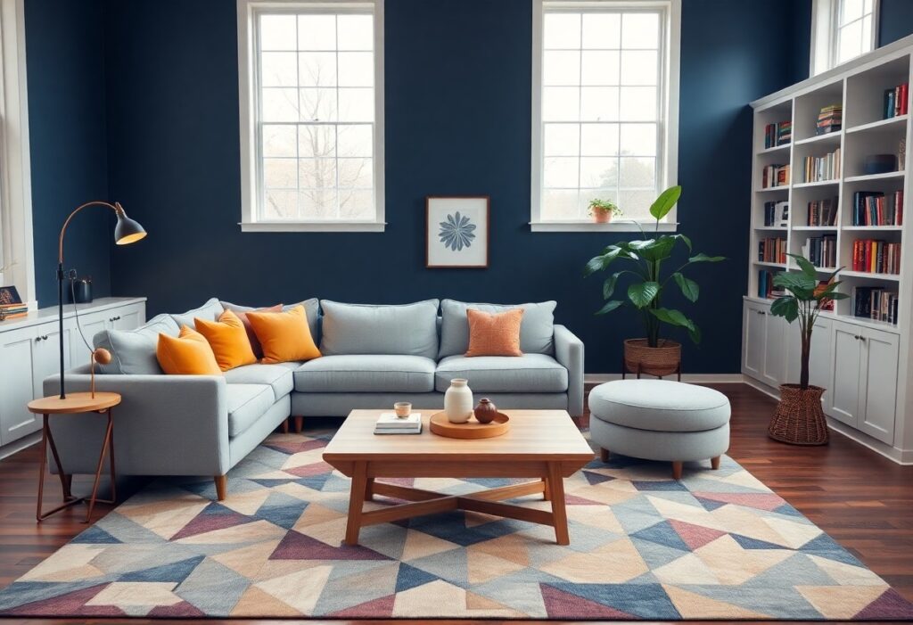
There’s a powerful psychological impact behind the colors you choose for your family room. I’ve seen how warm tones like red and orange can energize a space, while cool blues and greens bring calm and relaxation. The wrong shade can create tension, but the right palette strengthens connection and comfort in your shared environment.
Key Takeaways:
- Warm colors like reds, oranges, and yellows can make family rooms feel cozier and encourage conversation, but too much intensity may lead to overstimulation, especially in shared spaces used for relaxation.
- Cool tones such as soft blues, greens, and lavenders promote calm and reduce stress, making them ideal for multi-use areas where people need to unwind or focus.
- Neutral palettes with accent colors offer flexibility, allowing family members to personalize the space while maintaining a balanced, harmonious environment that suits diverse preferences.
The Soul of the Shared Palette
I believe the colors we choose for family rooms shape how we connect, relax, and recharge together. Your shared space isn’t just a room-it’s a reflection of collective energy and emotional tone. I’ve seen how a well-balanced palette invites conversation, soothes tension, and strengthens a sense of belonging through subtle, daily influence.
The Vitality of Saffron and Ochre
You can’t ignore the warmth that saffron and ochre bring to a shared space. I find these tones spark energy and openness, making them ideal for areas meant for laughter and connection. They stimulate conversation without overwhelming, grounding the room in earthy vibrancy that feels inviting, not intense.
The Serenity of Azure and Sage
Calm flows naturally when azure and sage take center stage. I notice how these hues soften the air, making tension melt as you enter the room. They create a peaceful backdrop that supports relaxation and mindful interaction, perfect for spaces where family members unwind together.
I’ve watched families transform their daily rhythms simply by shifting to azure and sage. These colors don’t just paint walls-they influence breath, tone, and mood. I’ve seen children settle faster after school, and adults release stress more easily in these tones. The psychological weight of cool, natural hues helps regulate emotions, making them a quiet but powerful choice for any shared retreat.
The Social Grace of Pigment
I’ve seen how the right hue can transform tension into tranquility in shared spaces. Color doesn’t just decorate-it communicates. Soft blues and warm greys invite calm conversation, while bold accents spark connection. You shape behavior with every paint choice. Learn more about how this works at How Color Affects Mood in Shared Spaces.
Encouraging Wit with Warm Neutrals
You create a backdrop for laughter and spontaneity when you choose warm neutrals like beige, taupe, or greige. These tones feel inviting without demanding attention. They support interaction instead of overshadowing it, letting personalities shine. I find they make even casual moments feel rich with comfort and ease.
Softening the Clamor of Domestic Life
Every home carries noise-not just sound, but visual chaos from toys, clutter, and constant use. I rely on muted greens and gentle lavenders to bring balance. These colors absorb stress instead of reflecting it, helping you reclaim peace without sacrificing warmth or liveliness in your space.
When I design shared areas, I prioritize colors that act like a deep breath after a long day. Muted greens mimic natural settings, lowering heart rates and easing eye strain from screens and sunlight. Lavenders offer a quiet elegance, reducing anxiety without feeling cold. You don’t need silence to find calm-sometimes, it’s just one soothing wall away.
The Marriage of Utility and Beauty
I believe a family room should serve both comfort and character. You don’t have to sacrifice style for practicality-deep hues withstand spills while pale tones open tight spaces. I’ve seen how the right color balances daily wear with visual warmth, making your shared space feel lived-in and luxurious at once.
Forgiving Nature of Deep Velvets
Deep velvets hide everyday messes like crumbs, smudges, and pet prints without looking neglected. I often recommend charcoal, navy, or forest tones because they maintain elegance even under heavy use. These shades give your walls a rich, resilient finish that stands up to family life.
Illusion of Grandeur in Pale Tints
Pale tints make compact rooms feel larger and more open. I’ve watched small family spaces transform with soft whites, misty greys, and barely-there blushes. They reflect light beautifully, giving your walls a subtle expansiveness that feels calm and inviting.
When I use pale tints in shared areas, I notice how they amplify natural light and create an airy rhythm throughout the room. These colors don’t just mimic space-they change how you experience it. A low-ceilinged den can feel like a sunlit lounge when painted in whisper-soft hues. The effect is deceptively powerful: minimal pigment, maximum impact, all while keeping the mood serene and inclusive for every family member.
The Drama of the Accent
I believe a single bold hue can transform your family room from ordinary to unforgettable. Accent walls in deep indigo or terracotta draw the eye and anchor the space with intention. For deeper insight into how color shapes mood and behavior, I recommend this article on Color Psychology in Interior Design.
Establishing a Center of Gravity
One wall in saturated rust pulls your attention the moment you enter. This focal point organizes the entire room’s energy, giving furniture and decor a natural alignment. I’ve seen families gather instinctively around these zones, drawn by warmth and depth only rich tones can provide.
Whispers of Contrast in Trim
Painting trim in a slightly darker shade than the walls adds subtle depth without overwhelming. These quiet lines guide your eye and sharpen the architecture, making ceilings feel higher and corners more defined. I use this trick when clients want elegance without drama.
What makes trim contrast so effective is how it works quietly, enhancing proportions without demanding attention. I often choose a tone just one step deeper than the wall-like charcoal-gray baseboards in a soft gray room. This whisper of difference creates polish and intention, turning simple spaces into thoughtfully designed environments you experience more than see.
The Rhythm of the Seasons
I notice how natural light shifts throughout the year, reshaping the mood of our shared spaces. You don’t need to repaint every season-just adjust accents and textiles to mirror the outdoors. In spring, I bring in soft greens; in fall, I deepen hues with rust and amber. These subtle shifts keep your space feeling alive and connected.
Dancing with the Afternoon Sun
Light floods in around 3 PM, transforming walls and furniture with golden warmth. I watch how yellow and peach tones amplify this glow, making your room feel larger and more inviting. Overlook this peak brightness, and cooler shades may appear dull or flat. You can use sheer curtains to soften harsh rays while preserving the energy sunlight brings.
Chromatic Depth in Winter Shadows
Shorter days cast longer shadows, muting even the boldest colors. I’ve learned that rich jewel tones like deep teal or burgundy hold their presence when light fades. These hues add warmth and dimension where grays and pastels might feel cold. You’ll find your space more comforting when your palette respects winter’s quiet light.
Winter light has a stillness that changes how color behaves. I rely on layered lighting-floor lamps, candles, warm LEDs-to enhance the depth of darker pigments. Without this support, even well-chosen paints can look flat or lifeless by 4 PM. Pairing deep walls with textured fabrics like wool or velvet keeps the room feeling rich and lived-in, not cavernous. You’re not fighting the season-you’re harmonizing with it.
A Symphony of Compromise
I’ve learned that shared spaces thrive not on one person’s taste, but on a blend of voices. Choosing colors becomes less about winning and more about listening. The most successful family rooms reflect a balance, where no single preference dominates, but each feels seen and respected in the final palette.
Respecting the Singular Eye
I understand that one person might have a strong vision or sensitivity to certain tones. Dismissing that perspective can breed resentment, even in subtle ways. I make space for that individual insight, ensuring their comfort isn’t sacrificed, because harmony includes honoring personal needs within the collective.
Unity Through a Shared Vision
I believe a shared color story can become a symbol of togetherness. When you and your family help choose the hues, the room transforms into a true reflection of your collective identity. This joint ownership fosters pride and connection every time you gather within those walls.
I’ve seen how a unified palette, born from open conversation and mutual agreement, does more than coordinate decor-it strengthens bonds. When you walk into a space and recognize the blues your child picked, the warm accent your partner insisted on, and the neutral base you all agreed fit best, you’re not just seeing paint-you’re seeing collaboration made visible. That sense of belonging, built one color at a time, turns a room into a home.
To wrap up
With these considerations, I’ve seen how color shapes the mood and function of your family rooms and shared spaces. I choose warm tones to invite conversation and cool hues to calm energy, aligning each shade with how you live. Your space reflects your life-color becomes a quiet guide, not just decoration.