
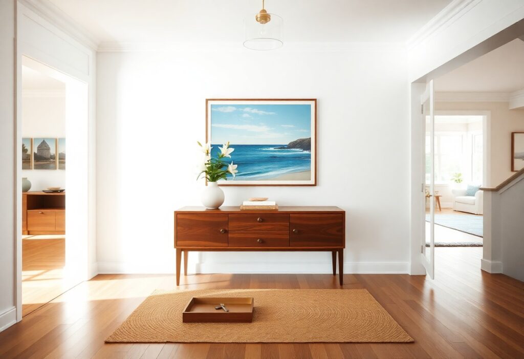
Most guests form an opinion about your vacation rental within seconds of stepping inside, and I’ve found that the right artwork can make the difference between a forgettable stay and a memorable, shareable experience. You don’t need a gallery wall to impress-just one bold, intentional piece that speaks to place, personality, and comfort. What you choose to hang, and where, quietly shapes how your guests feel before they even unpack.
Key Takeaways:
- A well-placed landscape painting of the surrounding region can instantly ground guests, creating a sense of arrival and context-such as a watercolor of the Maine coastline in a coastal cottage, which reinforces the location’s natural appeal.
- Abstract art with a restrained palette of three to four tones that echo the room’s colors helps establish mood without overwhelming, allowing the space to feel curated rather than cluttered.
- Artwork printed on canvas or mounted wood, rather than mass-produced posters, signals attention to detail and contributes to a perception of quality, as seen in high-rated rentals that prioritize material authenticity.
The Philosophy of the First Gaze
The Surface as the True Substance
I’ve watched guests pause just inside the door, eyes drawn not to the view but to the large canvas near the entry. What meets the eye first isn’t background-it becomes the tone. A well-chosen piece doesn’t decorate, it declares. Texture, scale, and color act immediately, shaping perception before a single suitcase hits the floor.
Captivating the Idle Traveler
Travelers often stand still for a breath after entering, absorbing the space. That moment of stillness is an opening. A striking artwork capitalizes on it, anchoring attention before movement resumes. I once replaced a generic seascape with a bold, local artist’s mixed-media piece and saw guests engage within seconds.
That shift wasn’t subtle. People tilted their heads, stepped closer, even snapped photos not of the room, but of the art. The piece featured layered maps, fabric, and paint from a nearby fishing village, making it feel both abstract and deeply rooted. Its authenticity sparked curiosity, turning passive observation into active connection. A guest later mentioned it made them feel they’d already begun discovering the place.
The Local Landscape as High Art
I treat the surrounding terrain not as scenery but as subject matter worthy of gallery walls. A large-format photograph of fog rolling over coastal bluffs, or an oil painting capturing the exact slant of light at dusk in the desert, signals to guests that this place has depth. The art becomes a lens, focusing attention on what makes the location unique. When done well, it doesn’t just decorate-it reveals.
Evoking the Spirit of the Soil
A watercolor of twisted olive trees against a chalk-white cliffside does more than depict a view; it carries the scent of dry earth and sea salt. I look for pieces that reflect the region’s natural palette-ochre, slate, sage-so the artwork feels like an extension of the land itself. This rootedness makes the space feel intentional, not imported.
Rejecting the Common Souvenir
I avoid mass-produced prints of lighthouses, pineapples, or cartoonish surfboards-objects that reduce a place to cliché. These items suggest the rental lacks confidence in its own identity. Instead, I choose work that trusts guests to appreciate subtlety over slogans. Authenticity resonates more than recognition.
One coastal property I advised on had replaced generic beach scenes with a series of charcoal sketches of local tidal pools, drawn by a marine biologist who taught at the nearby university. The drawings were precise, almost scientific, yet undeniably poetic. Guests consistently remarked on them, often asking where they could learn more about the ecosystem. That shift-from decorative to meaningful-transformed how the space was perceived. The art didn’t just hang on the wall; it invited engagement.
The Allure of Abstract Expression
I find abstract expression draws guests in without demanding explanation, its emotional pull immediate and personal. Bold strokes or layered textures invite interpretation, sparking curiosity the moment you step inside. For more inspiration on setting this tone from the threshold, explore these Vacation Rental Entryway Ideas for the Best First Impression.
Colors That Whisper Secrets
Deep indigo or muted terracotta can evoke calm before a single suitcase is unzipped. I’ve seen a guest pause mid-step at the sight of a maroon-hued canvas, its richness mirroring autumn dusk. These tones don’t shout luxury-they suggest it, subtly shaping your perception of the space.
Shapes for the Sophisticated Soul
Irregular organic forms in a composition create quiet tension, a visual rhythm that feels both intentional and unrestrained. I prefer asymmetrical arrangements over rigid geometry-they mirror nature’s elegance and keep the eye gently moving, never settling too quickly.
One installation I designed used three freeform resin panels in gradated slate tones, mounted at slight angles across a hallway. The shifting light throughout the day made the shapes appear to drift, a subtle motion that guests often remarked on without realizing why. This kind of dynamic presence-unpredictable yet harmonious-defines the sophistication I aim for.
The Geometry of Proper Placement
I prioritize sightlines the moment guests step inside, anchoring spaces with art that aligns with natural focal points. A well-placed piece at the end of a hallway or above a fireplace draws the eye and defines the room’s purpose. For guidance on balancing scale and subject, I refer to How to Choose Art for Your Airbnb or Vacation Rental, which outlines how intentional positioning amplifies impact without overwhelming the space.
Command over the Living Room
A dominant piece above the main seating area establishes authority in the living room, ideally centered and hung at eye level. I choose artwork with bold color or scale to anchor the space, ensuring it complements rather than competes with furniture. The ideal height is 57-60 inches from the floor to the center of the frame, matching museum standards.
Intimacy in the Sleeping Quarters
I favor smaller, quieter pieces in bedrooms, positioned above the bed at a lower height to invite closeness. Soft tones and organic forms support relaxation, while personal subjects like portraiture or nature studies add warmth. The proximity to the pillow matters-art should be visible from the mattress without straining the neck.
Bedroom art gains emotional weight through repetition and subtlety. I’ve seen guests linger longer in rooms where a series of three small prints flanks the nightstand, creating a curated rhythm. One coastal rental used muted seascapes in matching frames, each slightly different in tide and light, reinforcing the property’s seaside identity without overt signage. These quiet details, often overlooked, are what guests recall upon departure.
The Texture of Tangible Luxury
I notice how guests run their fingers along a handwoven throw or pause before a carved wooden panel, drawn not just to sight but to touch. Materiality shapes perception, turning a glance into an experience. A room with layered textures-linen, wool, raw silk-feels inherently more considered, more personal, and more luxurious than one relying solely on color or composition.
Textiles as Visual Poetry
I see linen curtains catching the breeze like brushstrokes, their subtle weave adding rhythm to the space. A single hand-dyed rug, with irregular edges and organic pigments, becomes a quiet focal point. These fabrics don’t just cover-they speak, conveying craft and care in every thread.
Dimensionality Beyond the Frame
I’ve watched guests lean in to examine a wall-mounted ceramic piece, its curves casting delicate shadows at different times of day. Unlike flat prints, three-dimensional works create shifting light patterns and invite closer inspection. Depth pulls the eye forward, transforming passive viewing into active engagement.
One coastal rental I advised on featured a series of salt-glazed wall sculptures inspired by tidal erosion. Their undulating surfaces caught morning light differently each day, making the same wall feel new over a week’s stay. These pieces didn’t just occupy space-they changed it, proving that art with physical presence can anchor a room’s identity far more effectively than any two-dimensional work alone.
The Sin of the Mundane
I’ve walked into too many rentals that feel like every other-generic beach prints, predictable sunsets, and mass-market canvases that say nothing about the place or the people who stay there. These choices flatten the experience instead of deepening it. That’s why I recommend exploring alternatives like Why Metal Wall Art Is the Best Décor for Airbnb and …, where material and method combine to create impact.
Banishing the Mass-Produced
Repeating the same framed ocean wave in every coastal rental erases character. I replace these with limited-run prints or site-specific photography that reflects the actual light, terrain, and culture of the location. Uniqueness registers instantly in a guest’s mind, even if they can’t name why.
Cultivating an Authentic Gallery
I treat each wall like a curated exhibit, not a filler space. Pairing a bold metal piece with handmade ceramics or local textiles creates layers of meaning. Guests respond to intentionality, not volume.
One mountain cabin I styled features a single large-format aluminum print of a winter storm rolling over the ridge-taken by a regional photographer during an actual blizzard. The metallic surface catches the gray alpine light, making the scene feel alive. This isn’t decoration; it’s a moment preserved, and it gives the room a story guests mention in nearly every review. I find that one powerful image outweighs a dozen safe choices.
Conclusion
I’ve found that the artwork which best shapes a guest’s first impression isn’t the most expensive or elaborate, but the one that feels intentionally chosen. A single, well-placed piece-a textured landscape from a local artist, perhaps, above a thoughtfully arranged seating area-can define a room’s tone more than any decor trend. You don’t need a gallery wall to make an impact; your guests will remember how the space made them feel, not the number of frames on the wall.