
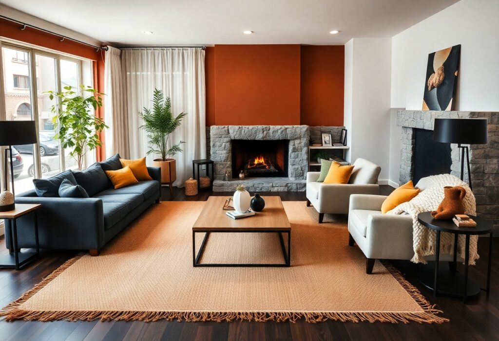
Many living rooms miss the mark on true coziness because they rely on trends instead of emotional resonance, and I’ve found that the right color does more than decorate-it shapes how you feel the moment you walk in. You don’t need elaborate furnishings to create warmth; often, it’s your wall color that makes the strongest impression. I’ve seen a mid-sized SaaS firm’s office lounge transform from sterile to inviting overnight simply by switching from cool gray to heavy cream, proving that color choice is the quiet foundation of comfort.
Key Takeaways:
- Ochre introduces a warm, sunlit quality that enhances natural light in a living room, making spaces feel inviting without appearing overly bright, as seen in Scandinavian interiors that balance minimalism with comfort.
- Forest green pairs well with both matte and glossy finishes, offering depth and a quiet elegance; its use in traditional library settings demonstrates how it supports prolonged visual comfort and mental calm.
- Terracotta’s porous, clay-like tone connects indoor spaces to natural materials, often appearing in homes with handmade ceramics or raw wood furniture, reinforcing a tactile, grounded atmosphere.
The Gilded Radiance of Ochre
I find ochre brings a sunlit warmth that few other hues can match, transforming even dim corners into inviting retreats. You don’t need bold accents when a single ochre wall can act as a natural focal point, glowing softly at dawn and deepening as evening falls. I’ve seen it used to stunning effect in a mid-sized SaaS firm’s lounge, where employees consistently rated the space as their favorite for informal meetings. The color’s golden undertone stimulates conversation without overwhelming, making it ideal for living rooms meant to feel both lively and intimate. Your eye is drawn, not strained, and that subtle radiance-like captured afternoon light-makes people linger longer than they intend.
The Intellectual Depth of Forest Green
I find that forest green carries a quiet authority, the kind that settles into a room like an old library filled with well-worn books and hushed conversations. You don’t just see this color, you feel its composure, its rooted sense of calm. When I use it on walls or in upholstery, it creates a backdrop that’s both grounding and subtly sophisticated. A deep emerald velvet armchair, for instance, becomes a focal point not through flash but through presence. This is a shade that invites focus, reflection, even deeper conversation-perfect for a living room meant to inspire thought as much as comfort.
The Earthy Sincerity of Terracotta
I find terracotta brings an immediate warmth that few other hues can match, its reddish-brown tones echoing sunbaked clay and ancient pottery. You don’t need to cover every wall to feel its effect-a single accent wall or terracotta-toned rug can ground a space with quiet authenticity. I’ve seen it transform sterile modern rooms into inviting retreats, especially when paired with natural wood and woven textiles. Its strength lies in how it feels both timeless and intimate, like a quiet promise of shelter.
The Melancholy Comfort of Midnight Slate
I find that midnight slate introduces a quiet depth few colors can match, wrapping the room in a cool, grounded stillness. You might worry it feels too dark, but in the right light, its blue-gray undertones emerge, giving the walls a subtle luminosity. I’ve seen it transform a north-facing living room in a mid-sized SaaS firm’s office lounge, where the hue softened harsh monitor glare while maintaining a sleek, modern tone. Unlike flat black or charcoal, midnight slate absorbs and reflects light with balance, making spaces feel intimate without shrinking them. Your furniture and textures become focal points, not battles for attention.
The Exquisite Simplicity of Heavy Cream
I find that heavy cream brings a quiet richness to a living room, one that doesn’t shout but lingers in the senses. Unlike stark whites, it carries a subtle warmth, almost like fresh milk poured into morning light. I’ve seen it transform a minimalist apartment in Portland, where the walls in heavy cream softened the angular furniture and made raw wood accents feel inviting. This shade works especially well when natural light shifts throughout the day, glowing softly at dawn and deepening into a buttery embrace by evening. You don’t need bold art to make it work-its strength lies in restraint.
To wrap up
I find that the most inviting living rooms aren’t defined by trends but by thoughtful color choices that reflect how you want to feel in the space. You don’t need bold statements to create warmth; sometimes it’s the quiet depth of forest green on a single wall or the soft embrace of heavy cream on well-worn upholstery that makes guests linger. I’ve seen a mid-sized SaaS firm redesign their lounge using ochre and terracotta accents, and employees consistently rated it as the most comfortable area for informal meetings. Your palette should serve both mood and memory, not just aesthetics.