
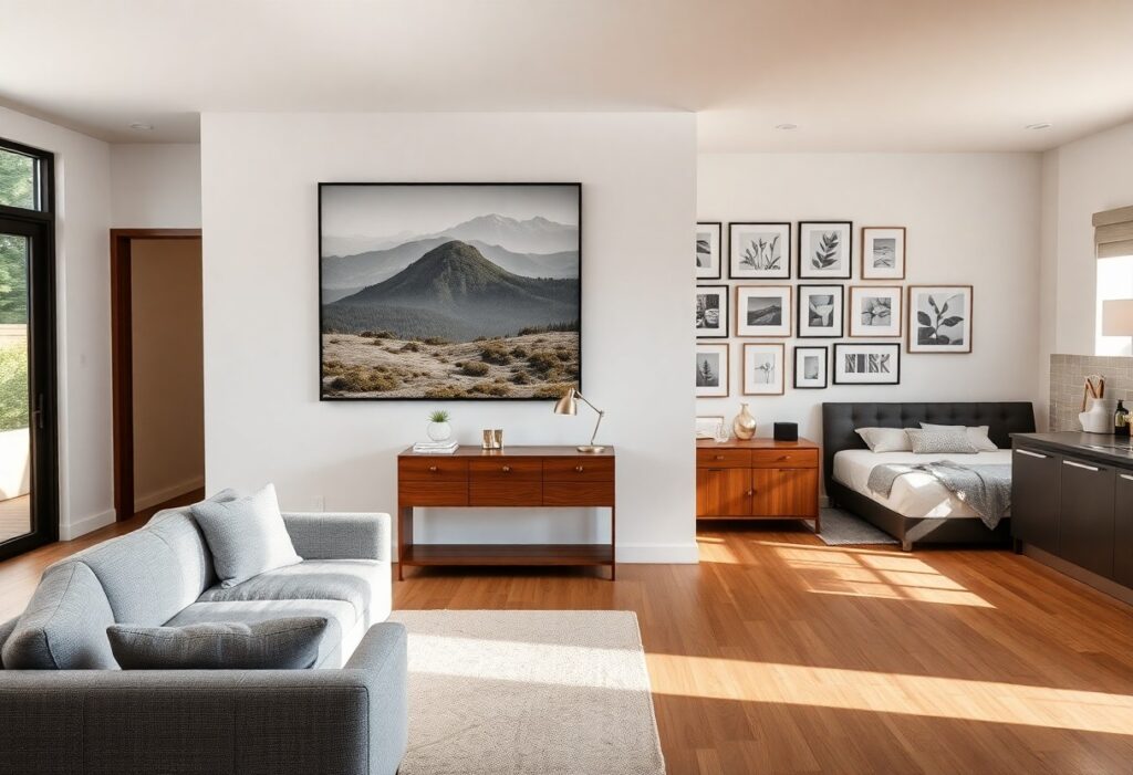
There’s a quiet power in the right piece of art-it can transform a room from ordinary to deeply personal. I’ve seen how a single painting or photograph, thoughtfully placed, shifts the energy of a space. You don’t need a gallery budget or an interior designer to get it right. What matters most is alignment: with the room’s function, your emotions, and the existing design. A mismatched piece can disrupt harmony, while the right choice adds depth and continuity. I’ll guide you through selecting artwork that feels intentional in every room.
Key Takeaways:
- A room’s function should guide the tone and subject of its artwork-a high-traffic kitchen benefits from durable, easy-to-clean pieces, while a bedroom calls for softer imagery that supports relaxation.
- Scale matters more than style; a large wall in a spacious living room demands a single oversized piece or a tightly grouped arrangement, whereas a narrow hallway may suit a vertical diptych or tall, slender frame.
- Consistency in framing or color palette can unify mismatched pieces across rooms, as seen in a Brooklyn brownstone where black metal frames and recurring ochre accents tied together abstract paintings, vintage maps, and family photographs.
Key Factors to Consider Before Selecting Art
Room dimensions, lighting conditions, and the space’s function shape every effective art decision. I prioritize scale, color harmony, and emotional tone to ensure each piece complements its environment. After
- assessing wall size relative to furniture
- observing natural and artificial light patterns
- aligning artwork with the room’s daily use
Assessing room dimensions and wall scale
A large wall in a spacious living area can handle a bold, oversized canvas, while a narrow hallway benefits from a vertical piece or a tight cluster. I match the artwork’s footprint to the available wall space, ensuring it doesn’t overwhelm or disappear. After
Analyzing lighting conditions and color palettes
North-facing rooms with cool, diffused light may mute warm tones, so I choose pieces with slightly heightened saturation to compensate. Glare from overhead fixtures can wash out a print, especially under glass. After
Light plays an active role in how color and texture are perceived. A painting that looks balanced in a gallery may appear dull in a dim corner or too intense in direct sunlight. I examine how light shifts throughout the day, noting where shadows fall and where reflections occur. Matte finishes often work better in bright kitchens, while a living room with controlled lighting can support a glossy finish. The existing color scheme-whether neutral or bold-guides my selection of complementary or contrasting hues, ensuring the artwork feels integrated, not imposed.
Evaluating the functional purpose of the space
A home office needs clarity and focus, so I lean toward structured compositions or motivational imagery. Bedrooms call for softer themes that support relaxation, not stimulation. After
The way you use a room determines the emotional weight the artwork should carry. In a playroom, I might select whimsical, colorful prints that spark imagination and withstand energetic activity. A dining area benefits from art that encourages conversation-perhaps a vibrant still life or an abstract piece with dynamic movement. In contrast, a reading nook thrives with a quiet, contemplative image that doesn’t distract from the act of reading. I always consider who occupies the space and what mood supports its primary activity, ensuring the artwork enhances, rather than conflicts with, the room’s purpose.
How to Choose a Focal Point for the Living Room
I anchor the living room’s visual energy by selecting one dominant piece above the sofa or fireplace, often a large painting or gallery arrangement. A mid-sized SaaS firm might prioritize clean lines and neutral palettes, but I prefer bold contrasts to draw the eye. Art that spans at least two-thirds the width of the furniture below creates balance and prevents the wall from feeling disjointed. Learn more about intentional placement at How to Pick Art for Every Room.
Selecting statement pieces for large wall surfaces
Large walls demand artwork with presence, so I choose oversized canvases or triptychs that fill the space without overwhelming it. A single photograph printed on a wide-format panel can become a quiet centerpiece when surrounded by negative space. Scale matters more than color here, as undersized art makes a room feel cluttered and poorly planned.
Coordinating styles with existing furniture and textiles
I match the artwork’s tone to the room’s materials, such as pairing mid-century modern frames with teak furniture or rustic prints with linen upholstery. A charcoal sketch feels out of place beside a velvet Chesterfield, just as a gilded landscape clashes with industrial metal seating. Consistency in era or texture grounds the composition and avoids visual competition.
I once hung a contemporary abstract piece above a 1970s walnut credenza, only to realize the angular lines fought with the cabinet’s soft curves. After switching to a fluid ink drawing with organic shapes, the room settled into harmony. The frame finish also plays a role-brushed brass echoes gold-threaded pillows, while matte black complements slate tiles. These subtle echoes create cohesion without matching everything exactly.
Tips for Creating a Restful Atmosphere in the Bedroom
I focus on calming visuals that support relaxation and uninterrupted sleep. Soothing colors like soft blues, warm greys, and muted greens dominate my selections, paired with minimalist compositions that avoid visual clutter. A single, well-placed piece often works better than a gallery wall. The placement above the headboard ensures balance and cohesion with the bed’s proportions.
- Soothing colors promote calm and reduce visual stimulation
- Minimalist compositions prevent clutter and support mental relaxation
- Placement above the headboard anchors the bed and aligns with feng shui principles
Utilizing soothing colors and minimalist compositions
I choose artwork with soft tonal palettes because they lower visual tension and support a tranquil environment. A simple line drawing in charcoal on cream paper adds subtle texture without disruption. The absence of bold contrasts or complex patterns keeps the mind at ease. The emotional impact of restrained design is often more powerful than dramatic imagery.
Determining the ideal placement above the headboard
I hang artwork 4 to 6 inches above the headboard to create a visual connection without crowding the wall. The piece should span no more than two-thirds of the bed’s width for balanced proportions. The eye-level alignment ensures it feels grounded, not floating. The spatial harmony between bed and art enhances the room’s sense of order.
When I assess placement, I consider both ceiling height and headboard design. A tall headboard with clean lines allows for a larger piece, while a low profile calls for something narrower and closer to the mattress. I avoid hanging art too high, which breaks the intimate scale of the sleeping area. The vertical gap of 4 to 6 inches remains a reliable standard across different bed types. The relationship between furniture and frame defines the room’s quiet elegance.
Enhancing Practical Spaces: Kitchens and Dining Areas
I treat kitchens and dining areas as functional zones where art must withstand daily wear while reinforcing warmth and activity. These rooms thrive with pieces that reflect nourishment and gathering, so I lean toward imagery that feels inviting yet durable enough for high-traffic use. A well-placed artwork here doesn’t just decorate-it completes the experience of shared meals and casual conversation.
Choosing art that complements culinary themes
I often select still-life paintings of fruit, vintage kitchen utensils, or hand-lettered recipes because they echo the room’s purpose without feeling literal. You might display a print of a bustling farmers’ market or a close-up of herbs, adding character while keeping the mood light and appetizing. These choices subtly celebrate food and tradition, making your space feel more intentional.
Selecting moisture-resistant materials for high-utility zones
I insist on sealed canvas, acrylic glass, or metal prints in areas exposed to steam and splashes, as these materials resist warping and mold. You risk damaging delicate paper or uncoated wood near sinks or stoves, so I recommend avoiding them entirely. Moisture can ruin unprotected artwork within months, especially above a dishwasher or beside a stovetop.
When I specify materials for kitchen walls, I prioritize longevity over trend. For example, a mid-sized SaaS firm’s office kitchen I advised used aluminum-mounted prints that survived daily use without fading or swelling. These surfaces handle humidity fluctuations and occasional grease exposure far better than traditional frames. Even with ventilation, steam accumulates in unpredictable patterns, so sealed edges and non-porous surfaces are non-negotiable for lasting display.
How to Balance Art Proportions with Furniture
I consider the size and shape of furniture when selecting wall art, ensuring pieces complement rather than compete. A large sofa pairs well with a substantial painting or gallery arrangement, while smaller furnishings suit more delicate works. Following discussions in online communities, like how do you pick artwork for your home?, I’ve learned many prioritize harmony between frame width and furniture span, avoiding pieces that overwhelm or underfill the visual space.
Applying the sixty-percent rule for wall coverage
I apply the sixty-percent rule by selecting artwork that spans roughly 60% of a sofa’s or bed’s width, creating visual balance without overcrowding. This proportion feels naturally aligned, allowing negative space to frame the piece while anchoring it to the furniture below. For a mid-sized SaaS firm’s lounge area, this approach kept the wall from appearing cluttered or sparse.
Aligning artwork height for optimal eye-level viewing
I hang the center of the artwork at eye level, typically 57 to 60 inches from the floor, to ensure comfortable viewing in most rooms. This standard prevents straining the neck and keeps the piece accessible to the gaze, especially in hallways or seating areas where people linger. Proper alignment makes even smaller works feel present and intentional.
When adjusting for different ceiling heights or furniture configurations, I still use eye level as my baseline but shift slightly upward in rooms with tall walls to maintain visual connection. Over a low credenza in a dining room, I position the bottom of the frame 6 to 8 inches above the surface, ensuring cohesion between object and art. This vertical rhythm strengthens the room’s composition and guides the eye naturally from furniture to wall, enhancing the sense of unity without relying on symmetry.
Expert Tips for Building a Cohesive Home Gallery
Creating a unified gallery across rooms relies on thoughtful curation, not uniformity. I prioritize intentional selection, choosing pieces that reflect personal meaning while aligning with the home’s overall color palette and design rhythm. Mixing vintage sketches with contemporary prints works when a common thread-like subject or tone-ties them together. Recognizing How To Decide On Art In Your Home: What To Buy And … helps refine long-term choices.
Mixing different mediums while maintaining a theme
A charcoal sketch beside a ceramic plate and a digital print can coexist when linked by a shared theme, such as nature or urban life. I balance texture and tone so the visual weight feels intentional, not chaotic. The contrast between matte paper and glossy surfaces adds depth without disrupting harmony.
Using consistent framing to unify diverse art styles
Even when styles vary widely, I use matching frames to create visual continuity. Choosing black metal or natural wood across all pieces grounds the collection. This simple decision shifts focus from the differences in art to the overall composition on the wall.
Consistent framing doesn’t mean every frame must be identical, but maintaining a similar finish or profile keeps the eye moving smoothly. I’ve seen a mid-sized SaaS firm’s office transform when they standardized frame colors across employee-submitted artwork, proving that uniformity in presentation strengthens perceived cohesion. The effect works just as well in homes, where eclectic tastes can still feel curated.
To wrap up
I consider the personal connection you have with a piece to be the true measure of its fit in your home. While scale, color, and lighting guide placement, it’s your daily experience of the artwork that matters most. I’ve seen a simple sketch bring more joy to a hallway than an expensive painting did in a formal lounge. Your home should reflect what resonates with you, not what conforms to trends. A mid-sized SaaS firm may prioritize data, but in interior choices, emotion leads.