
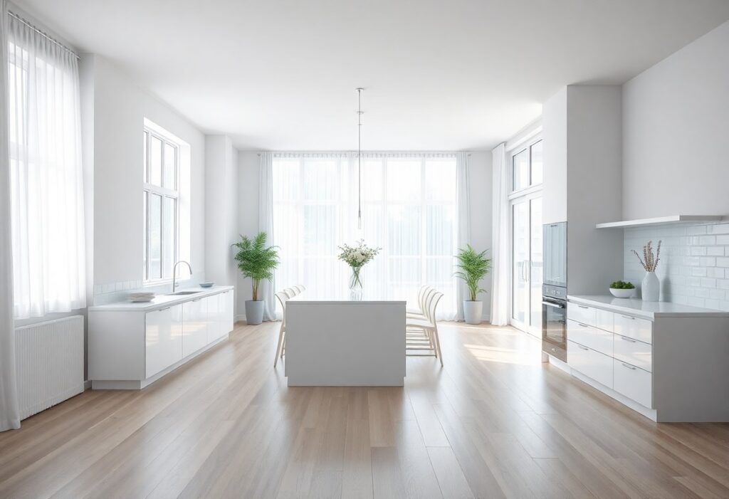
Over the years, I’ve noticed how a single coat of paint can quietly transform a room from feeling dull to sparkling with light. You don’t need a full renovation to make your space feel fresh-sometimes, choosing the right color does the heavy lifting. I’ve seen a mid-sized SaaS firm repaint their office lounge in a soft, sun-bleached beige, and suddenly the whole area looked tidier, even with the same furniture. Your walls hold more power than you think.
Key Takeaways:
- White, especially in its purest form, reflects the most light and can make a room feel larger and more open, which a mid-sized SaaS firm might mimic in its office design to promote clarity and focus.
- Soft pastels like pale mint or blush add subtle color without absorbing much light, helping maintain brightness while introducing warmth, as seen in many Scandinavian-inspired living rooms.
- Greige-a blend of gray and beige-offers a warm neutral base that feels clean but not sterile, often used in high-end model homes to appeal to a broad range of buyers.
The Virtue of Absolute White
I’ve painted entire rooms in pure, unadulterated white and felt the space instantly lift, like opening a window on a clear morning. This shade reflects every bit of light, making even dim corners feel awake and attended to. You don’t need bold accents when your walls are this responsive to sunlight, candle glow, or a simple lamp’s warmth. White doesn’t hide dust-it reveals it, which means you’re more likely to keep surfaces tidy, adding to the sense of cleanliness. A friend once told me her landlord insisted on white kitchens because it made inspections easier, but she ended up loving how crisp and edited everything looked. I noticed her towels, dishes, even fruit on the counter seemed more vivid, as if the white frame made daily life feel curated.
The Whimsy of Ethereal Pastels
I find that a whisper of color can make a space feel fresh without sacrificing warmth, and that’s where soft pastels shine. You might think pale mint, blush pink, or lavender would dull a room, but when paired with ample natural light, they reflect brightness while adding subtle character. I once painted a north-facing bathroom in a delicate sky blue, and the way it lifted the mood surprised even me-it felt airy, clean, and just a little dreamy.
The Sophistication of Silvered Greys
I’ve painted entire living spaces in silvered greys and watched how they transform under natural light, reflecting cool brightness without feeling sterile. These tones, like a polished mercury glass or a storm-soft charcoal, add depth while maintaining an airy feel. You’ll notice how they hide dust better than white, yet still convey crispness, especially when paired with white trim or pale oak floors. A mid-sized SaaS firm once repainted their office lounge in a warm greige with silver undertones and reported fewer complaints about glare and visual fatigue.
The Luster of Sun-Dunched Neutrals
I’ve noticed how warm beiges and creamy taupes can make a space feel both clean and inviting, especially in homes with limited natural light. Unlike stark whites, these tones reflect sunlight gently, reducing harsh contrasts while maintaining brightness. You might be surprised how a soft camel accent wall in your living room can make dust and smudges less obvious, giving the whole space a tidier appearance. Warm neutrals don’t just hide imperfections-they make your home feel consistently fresh, even on days when you haven’t had time to tidy up.
Final Words
I’ve found that the right color can quietly transform how a space feels, making it seem tidier and more open even without a deep clean. When you’re choosing paint, I always suggest imagining morning light spilling across the walls-crisp whites, soft blues, or warm taupes tend to hold that glow best. Your home doesn’t need bold statements to feel fresh; sometimes, it’s the quietest hues that make the clearest difference.