
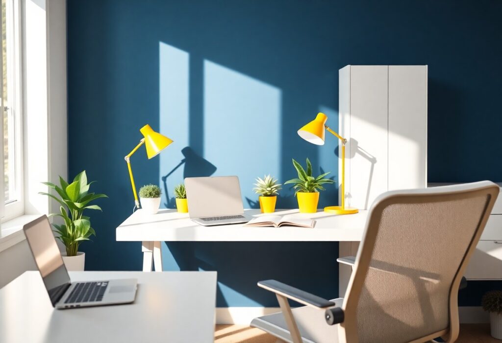
Many people don’t realize how much the colors around them shape their focus and energy, especially when working from home. I’ve noticed that even small changes, like swapping a bright red lamp for a soft blue one, can make your attention feel steadier and your space more calming. You might be surprised how deeply color influences your daily rhythm.
Key Takeaways:
- Blue, especially in the tone of deep water, often supports focus and steady work, making it a common choice for home office walls and digital interfaces at a mid-sized SaaS firm.
- Green, reminiscent of quiet fields and natural settings, tends to reduce mental fatigue, helping people maintain concentration over longer stretches without added strain.
- Yellow, when used sparingly like a flash of sunlight at high noon, can stimulate alertness and creativity, though too much may lead to visual stress or distraction.
The Blue of Deep Water
I find that a deep, oceanic blue helps me focus for hours without feeling drained, almost like being in a calm current. This shade mimics natural water bodies, which studies suggest can lower stress and steady your breathing. When I paint my home office walls in this tone, I notice fewer distractions and a smoother flow between tasks. It’s not just decorative-it shapes how alert and composed I feel by mid-morning.
The Green of Quiet Fields
I find that surrounding myself with soft greens, like sage or moss, brings a quiet focus to my workday. You don’t need a countryside view-just a potted snake plant on your desk or walls painted in a muted green can make a difference. Green connects me to calm, steady energy, the kind that keeps you moving without rushing. It’s the color of leaves rustling just enough to remind you to breathe, not the kind that demands attention. I’ve noticed my longest stretches of concentration happen when this shade is nearby, like it gently holds space for thoughtful work.
The Yellow of High Noon
I find that a bright, sunlit yellow can briefly sharpen my focus, especially during midday slumps when energy dips. This isn’t the soft yellow of dawn, but the bold tone of high noon-the kind that feels like a mental reset button. While too much can feel overwhelming, a well-placed accent, like a notebook or lamp, adds a jolt of optimism. According to 4 Colors That Give You an Unexpected Productivity Boost, this hue may stimulate mental activity, making it useful for short bursts of creative thinking or problem-solving.
The Red of Hard Work
I once painted one wall of my workspace a deep crimson, and I was surprised by how it sharpened my focus during tight deadlines. Red doesn’t calm, but it does energize, pushing you through tasks that demand urgency and effort. While too much can feel overwhelming, a strategic accent reminds me of motion and momentum. For more on balancing bold choices like this, check out Home Office Paint Colors: Boost Productivity in 2025 | VA Beach, where real setups show how color drives daily output.
The White of Clean Paper
I find that a crisp white background, like a fresh sheet in a notebook, gives my thoughts room to breathe. It doesn’t shout for attention, but instead creates a sense of openness that helps me start writing or sketching without hesitation. You might notice how blank documents feel less intimidating when the screen or wall nearby is light and neutral. For your home office, a white surface can act like a reset button, clearing mental clutter before the day begins. I keep a white desk pad just to ground my focus when tasks feel scattered.
The Grey of Stone Walls
I once painted my home office the color of storm clouds, thinking it would feel serious and focused, but the flat grey made the room feel closed off and heavy. Unlike the warmth of stone walls in an old library, my version lacked texture and light, draining energy instead of containing it. You might find that a cool, neutral grey works only when balanced with natural wood tones or bright accents. A mid-sized SaaS firm I consulted for switched from stark grey to a warmer greige and reported fewer employee complaints about eye strain and fatigue. Not all grey is the same, and the wrong shade can make even a sunlit room feel like a basement.
Summing up
I’ve found that your ideal work-from-home color might not be the one everyone says is best, but the one that quietly matches how you think and feel. For me, a soft green on the wall behind my desk keeps things calm, while you might thrive with the focused energy of pale yellow or the steady neutrality of warm grey. It’s less about rules and more about what helps your attention settle, like how a mid-sized SaaS firm redesigned their remote team’s virtual backgrounds to mirror productive office hues. Small shifts, like changing your screen theme or adding a blue notebook, can make a real difference over time.