
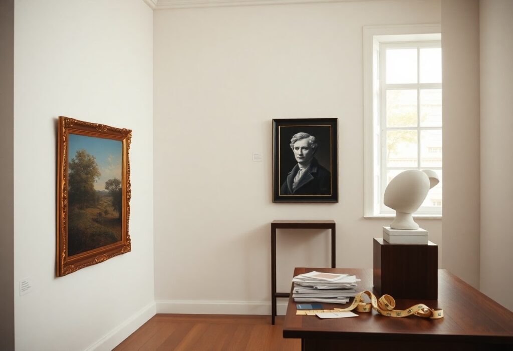
Artwork has a way of shaping a room’s soul, and I’ve learned that picking pieces that last isn’t about chasing trends. You don’t need a gallery budget, but you do need intention. Over the years, I’ve watched certain paintings and prints feel just as fresh today as they did a decade ago, while others quickly looked dated. The difference? Thoughtful choices, not impulse buys.
Key Takeaways:
- A piece rooted in strong composition and balanced proportions tends to remain visually satisfying across decades, like the careful geometry found in mid-century modern paintings or classical still lifes.
- Art that reflects authentic cultural or personal narratives-such as a handwoven textile from a traditional craft community or a black-and-white street photograph from the 1950s-often gains depth and relevance over time.
- Choosing artwork in a medium known for durability, such as oil on canvas or archival pigment prints, supports its physical endurance, ensuring it can be enjoyed for generations when properly cared for.
Key Factors That Define Timeless Art
Timeless artwork often shares certain qualities that help it endure across decades. Classic composition, emotional resonance, and technical mastery are common threads. I look for pieces that feel grounded yet expressive, where the subject and execution work in harmony. Assume that the most lasting works speak quietly but stay with you.
Embracing classic subjects and themes
I’m drawn to art that portrays enduring human experiences-family, nature, solitude, celebration. These universal themes connect across generations. A simple still life or landscape can feel fresh even decades later because it reflects something familiar. You don’t need novelty to feel moved.
Investing in high-quality materials
Materials matter more than many realize. I always check whether a painting uses archival pigments or a print is on museum-grade paper. Durability affects how well a piece ages, especially in changing light or humidity. Assume that a well-made artwork will look better longer, even in a bright room.
When I evaluate a piece, I consider how the materials interact over time. Oil paint on linen canvas, for example, has proven longevity, while pigment-based giclée prints on cotton rag paper resist fading far better than standard inkjet. A mid-sized SaaS firm might refresh its office every three years, but your art could remain-so choosing stable, quality materials means fewer compromises down the line.
How to Discover Your Own Lasting Style
I look for pieces that feel like they’ve always belonged, not ones that shout for attention. Style isn’t about what’s popular this season, but what quietly resonates over years. I pay attention to the art I revisit in galleries or save in folders, noticing recurring themes in texture, mood, or subject. That consistency is a signal, not a coincidence.
Trusting your gut over temporary trends
My instinct usually leans toward pieces that feel calm and grounded, not flashy or loud. When I follow trends, I often regret it later, but when I listen to that quiet pull toward simplicity or warmth, I never do. Trends fade fast, but a choice made from quiet certainty lasts.
Finding art that sparks a personal connection
I’m drawn to work that reminds me of a place I’ve lived, a feeling I’ve had, or even a memory I can’t quite name. It might be the color of my grandmother’s kitchen or the quiet hush of a forest trail I used to walk. That emotional pull turns a piece from decoration into something that feels like home.
One painting I bought years ago still hangs above my desk-a small landscape with a gray sky and a single path. I didn’t know the artist, and it didn’t match my sofa at the time. But it made me think of early mornings biking to work when I first moved to the city, trying to figure things out. Now, it’s not just art, it’s a quiet companion. Pieces like that don’t need to be famous or expensive to hold meaning. They simply need to speak to something true in you, quietly and clearly.
Useful Tips for Choosing Enduring Colors
Color choices shape how long your artwork feels fresh and relevant. I rely on neutral palettes as a foundation because they adapt easily to changing interiors. Timeless hues like warm grays, soft whites, and earthy taupes create calm backdrops. You can always shift the mood with accessories. The right balance of restraint and contrast keeps a piece feeling alive for decades.
Why neutral palettes stand the test of time
Neutrals blend effortlessly with evolving decor and lighting conditions. I’ve seen a single charcoal and cream abstract piece remain striking through three different living room styles. These subtle tones don’t compete with furniture or textiles. The consistency of their presence makes them quietly powerful.
How to incorporate bold accents wisely
Accent colors work best when used like punctuation-sparingly and with intent. I once added a small crimson detail to a muted landscape print, and it drew the eye without overwhelming. You don’t need large swaths of color to make a statement. The focal point stays clear and intentional.
When I introduce bold accents, I limit them to under 15% of the composition. A deep cobalt line in a drawing or a single amber leaf in a botanical sketch can anchor attention. These touches reflect personality without dating the piece. Over time, strong colors can feel loud or trendy, but isolated bursts maintain energy. The artwork keeps its balance, even as tastes shift.
Factors for Finding the Perfect Frame
Choosing the right frame can quietly make or break a piece’s longevity. I look for proportion, material honesty, and subtle finish that supports, not overshadows, the artwork. A well-chosen frame feels like a natural extension of the piece, not a decoration. Recognizing this balance is easier when you study timeless design choices, like those highlighted in 10 Design Elements That Will Never Go Out of Style.
- Proportion between art and frame matters more than trend
- Material should reflect the era and mood of the piece
- Finish works best when it enhances, not competes with, the artwork
Keeping it simple with clean lines
I often choose frames with clean lines because they adapt quietly to changing spaces and styles. Ornate details can date quickly, but a simple profile lets the art breathe and remain relevant. Your eye lands on the image, not the border.
Matching the frame to the soul of the piece
A frame should feel like it was always meant to hold that artwork, as if they grew up together. I pay attention to the mood of the piece-whether it’s quiet, bold, or nostalgic-and let that guide my choice. Your instincts usually know before your mind does.
When I see a vintage botanical print, I reach for a slim, warm wood frame that echoes its 19th-century roots. A modern abstract in bold colors might live better in a thin black metal that nods to gallery minimalism. The frame isn’t just protection, it’s context. It tells the viewer how to feel before they even process the image. I’ve seen a powerful photograph lose its edge in an overly decorative gold frame, just as a delicate sketch can drown in industrial steel. Matching the frame to the soul means honoring the artwork’s intention, not your current decor trend. Recognizing that distinction keeps the piece feeling authentic for decades.
How to Evaluate the Longevity of a Piece
I often check online discussions to see how others view lasting appeal, like this Most timeless style in your opinion? : r/InteriorDesign thread, where real people share what’s stood the test of time in their homes. Trends fade fast, but pieces that resonate emotionally tend to remain meaningful for decades.
Looking into the artist’s unique journey
I pay attention to an artist’s path because a consistent, authentic evolution often signals lasting relevance. When I see someone who’s spent years refining their voice without chasing fads, their work feels more grounded. Art rooted in personal truth rarely feels dated, even as tastes shift around it.
Considering the durability of the medium
I always ask how well the materials will age-some pigments fade, while others remain vibrant for generations. A beautiful print on low-quality paper may yellow or tear within years. Archival inks and cotton rag paper make a noticeable difference in how long your piece looks fresh.
Oil paintings, for instance, have survived centuries due to their stable binding and depth of color, while certain mixed media works may degrade if not properly sealed. I once saw a watercolor from the 1800s that still held delicate tones because it was kept from direct light. Properly cared for, the right medium can last a lifetime and beyond with minimal intervention.
To wrap up
I’ve learned that choosing artwork I’ll still love years from now means paying attention to how a piece makes me feel, not just whether it matches the couch. You don’t need to follow trends to have a space that feels personal and lasting. I look for pieces with quiet confidence-a simple line drawing, a muted landscape, or a portrait with honest eyes-and I trust that if I connect with it today, you probably will too, even a decade from now.