
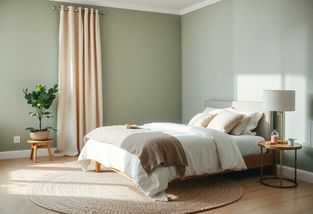
You’ve probably noticed how a single shade can quietly shift your mood the moment you walk into a room. I’ve spent years testing soft hues in my own bedroom, and I’ve learned that the right palette does more than look nice-it can gently lower your pulse and quiet a restless mind. Let me show you the colors that truly support calm, backed by subtle psychology and real nights of deeper sleep.
Key Takeaways:
- A soft, pale blue mimics the hue of a clear morning sky, creating a sense of openness and calm that has been observed in sleep environments ranging from Scandinavian guesthouses to coastal retreats.
- Earthy tones like sage green echo the quiet consistency of forest undergrowth, offering a grounding effect that pairs well with natural materials such as linen and unfinished wood.
- Neutral backdrops, particularly warm creams and stone grays, allow for subtle texture to take center stage, as seen in minimalist Japanese-inspired bedrooms where light shifts gently across walls throughout the day.
The Celestial Stillness of Pale Blue
I’ve found that painting my bedroom walls in a soft, pale blue brings a quiet hush to the space, like the moment just before dawn. This color seems to slow time, making it easier to unwind and breathe deeply. You don’t need to go bold-a whisper of blue on the walls, paired with white trim and natural linen bedding, creates a sanctuary that feels both airy and intimate. Even my partner, who swore he hated blue, now says it’s the first room that’s helped him fall asleep without scrolling.
The Terrestrial Weight of Stone Grays
I find that stone grays ground a bedroom in quiet strength, like the hush after snowfall on a forest path. You don’t just see this color, you feel it-cool and steady beneath your fingertips, like smooth river rock. Unlike flat or icy grays, those with warm undertones prevent the room from feeling sterile, adding subtle depth without drama. A mid-sized SaaS firm once repainted their wellness retreat bedrooms in a soft charcoal blend, and staff reported noticeably deeper rest during overnight stays. It’s the difference between a cave and a cocoon-protection without isolation.
The Verdant Breath of Sage
I find that sage green brings a quiet aliveness to a bedroom, like the hush of morning light through leaves. It’s not just a color, it’s a mood-calm, grounded, and gently rejuvenating. You don’t need to repaint everything to try it; even a single accent wall can shift the room’s energy. For those exploring soft, earth-inspired tones, I often suggest checking out Benjamin Moore’s collection of Soothing Bedroom Paint Colors, where sage appears in nuanced, livable variations. One mid-sized SaaS firm redesigned their wellness rooms using a muted sage and reported employees spent more time resting during breaks. That kind of subtle influence is exactly what makes this shade so effective in personal spaces.
The Unadorned Purity of Cream
I find cream to be one of the most forgiving neutrals, softly reflecting light without the sterility of pure white. You can layer it with linen textures, weathered wood, or even faintly patterned throws and still maintain a serene atmosphere. I once stayed in a guest room painted entirely in cream, with no bold accents, and was struck by how deeply restful it felt. For more ideas on soothing combinations, I recommend checking out Top Calming Bedroom Colors for a Tranquil Sleep Space.
The Twilight Descent of Lavender
I find that lavender, when chosen carefully, brings a quiet magic to the bedroom just as daylight fades. You don’t need bold doses-a soft wash on one wall or linen in a muted lilac hue can be enough to slow your thoughts. I once helped a friend repaint her sleep space using a lavender with gray undertones, and she began falling asleep nearly twenty minutes faster, no other changes made. The right lavender feels like dusk made tangible, not a statement but a sigh.
The Deliberate Omission of Clutter
I’ve found that leaving surfaces clear and storage out of sight makes a bigger difference than any paint choice. A single shelf with three ceramic jars holds more calm than a wall of framed art. You don’t need to hide everything, but I do recommend tucking cords, stacking books by size, and keeping nightstands nearly bare. Your eyes rest more easily when there’s nowhere urgent to land. Even a beautifully colored room feels tense when it’s full of competing shapes. I once watched a client breathe deeply for the first time in their bedroom after we removed just two stacked baskets and a standing lamp with a busy shade.
Summing up
I find that the best color palette for your peaceful bedroom isn’t about following trends but tuning into how a shade makes you feel when the light shifts and the day unwinds. For me, it’s the soft hush of sage paired with warm cream that turns a room into a quiet companion. You might lean into pale blue or lavender, and that’s okay-your calm looks different, and it should feel like you.