
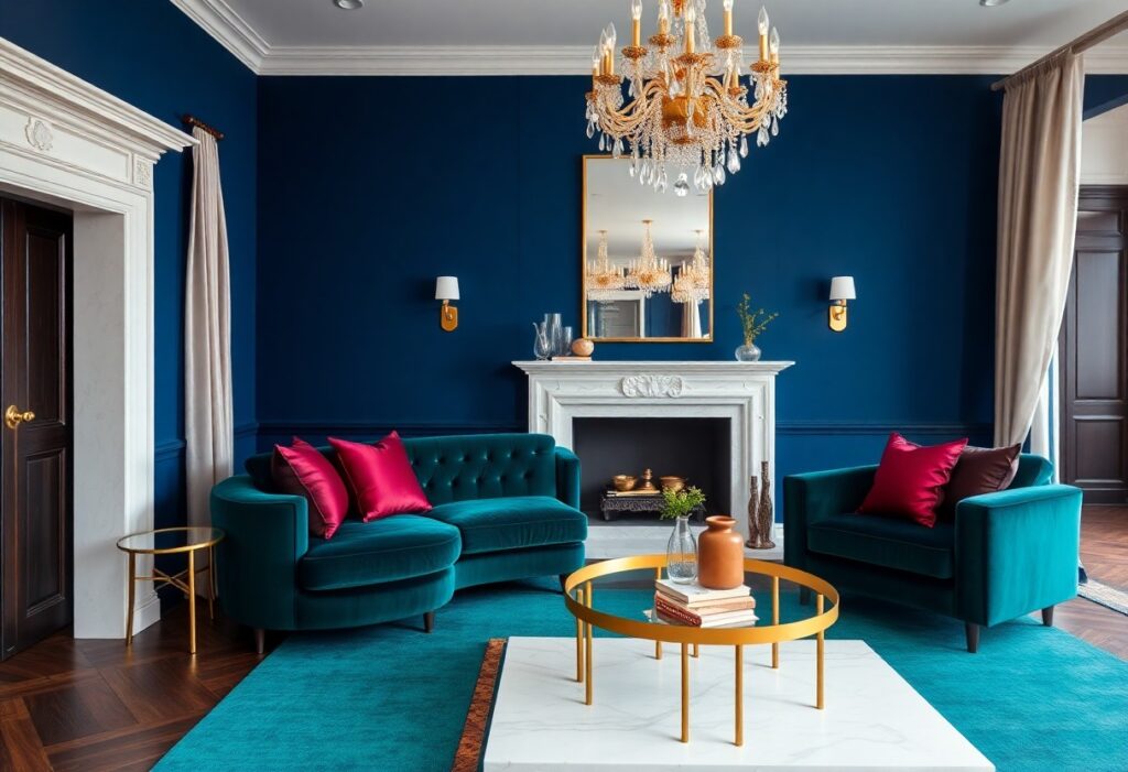
Colors shape how you experience a room before you even notice the furniture or art, and I’ve seen a soft gray wall transform a rental apartment into a serene retreat. Some shades quietly signal luxury not through flash but through depth, texture, and the way they catch light. I’ll show you which tones give that effortless richness and which ones risk feeling cold or outdated, based on real design choices that work.
Key Takeaways:
- Deep, saturated hues like navy, charcoal, and emerald create a sense of intimacy and refinement, especially when layered with textured fabrics such as velvet or wool-think of a sitting room where floor-to-ceiling drapes in matte black absorb light and amplify quiet elegance.
- Warm metallic accents, particularly in brass or antique gold, introduce subtle opulence without overwhelming a space; a single mirrored console with a champagne-toned frame can reflect ambient light and draw attention to architectural details like crown molding or carved doorways.
- Monochromatic schemes that rely on tonal variation within one color family-such as pairing slate gray walls with soft lavender upholstery and dove-gray rugs-add depth and sophistication while maintaining visual calm, a technique often seen in high-end boutique hotel suites.
The Majesty of Midnight
I’ve painted entire rooms in deep midnight blue and watched how the color transforms as daylight fades, taking on a velvety richness that feels both intimate and grand. You don’t need gilded accents for it to read as luxurious-this shade commands attention on its own, especially when paired with matte black fixtures or warm wood tones. A client once told me their midnight-lacquered dining nook felt like a private booth in a Parisian brasserie, which, honestly, is exactly the mood I’d hoped to create.
The Gilded Whisper of Champagne
The Gilded Whisper of Champagne
I’ve watched a single wall in a dimly lit hallway transform under the glow of champagne paint, its faint shimmer catching the light like dusted silk. Unlike harsh golds that shout wealth, this hue whispers sophistication, adding depth without demanding attention. I once helped a client choose it for their dining room, and the way candlelight danced across the surface at night made the space feel intimately opulent, not staged. Even in small doses, like on a bookshelf backdrop or trim, it elevates the ordinary with quiet confidence.
Emerald Envy and Regal Greens
I’ve always been drawn to deep emerald in living rooms and entryways, where its richness adds instant sophistication. You don’t need gilded moldings to feel opulent-this single shade can make a space feel curated and intentional. Designers often pair it with brass accents or matte black fixtures to heighten the drama. For more inspiration, check out this guide to 8 Paint Colors That Make Your House Look More Expensive-it’s helped me refine my own palette. The contrast between lush green walls and natural light creates a jewel-box effect that few other colors can match, especially in north-facing rooms.
The Discipline of Monochrome
I’ve found that limiting a room to a single color family can create a surprisingly rich effect, especially when you vary textures and tones. A charcoal wool rug, matte black metal fixtures, and a velvet gray sofa don’t compete-they harmonize, drawing the eye slowly across layers instead of jolting it with contrast. You don’t need bold accents when the depth comes from materiality, like fluted plaster walls or hand-rubbed cabinetry in the same hue. One client’s all-slate bathroom, with steam shower and floating vanity, felt like a private spa because nothing distracted from the calm precision of its palette.
Terracotta and Sun-Drenched Ochre
I love how terracotta wraps a room in quiet warmth, like the last glow of a desert sunset. You don’t need grand gestures to feel luxurious-just a well-placed ochre accent wall that catches the afternoon light can transform your space. I once painted a small reading nook in a sun-drenched ochre, and the way it changed with the daylight made it feel alive, shifting from honeyed gold in the morning to deep amber by dusk. These earth tones bring richness without opulence, grounding your home in a sense of place and time.
Final Words
I’ve found that luxury in color isn’t about price tags or trends, but how a shade makes you feel when you walk into a room. You don’t need gold leaf to create warmth, or imported marble to feel grounded. I once helped a friend paint her study a deep, quiet green, and she told me she finally felt proud to work from home. That’s the real measure: when your space doesn’t just look rich, but feels like it belongs entirely to you.